Wednesday, February 29, 2012

The John Wellborn Root House (1888)


The John W. Root House (1888) is located in Chicago’s Gold Coast neighborhood, across the street and down the block from the Charnley House. The following text about Root is taken from the Chicago Tribute – Markers of Distinction:
John Wellborn Root (1850–1891), Architect 
John Wellborn Root’s architectural designs helped to establish Chicago as the birthplace of modern architecture. After the Great Fire of 1871, Root came here from New York City to take part in the rebuilding of Chicago. He met Daniel H. Burnham and they formed a partnership considered one of the most important in architectural history. During their 18 years together, Burnham and Root designed more than 300 buildings, many in Chicago’s Loop. 
The firm began with residential commissions, but soon was asked to design commercial buildings. Their first important downtown building was the Montauk Building, where Root used a technologically innovative grillage of iron rails that distributed the building's weight over the entire ground area. 
Root’s designs often showed an honest expression of a building’s structure and deemphasized exterior ornament. His work includes two of the finest examples of the Chicago school of design: the Rookery Building and the Monadnock Block. The sparsely adorned Monadnock remains the world’s tallest office building with load-bearing walls. 
Root, who lived at 1310 North Astor Street, died of pneumonia at the age of 41. At the time, Burnham and Root were working on the site planning and architectural themes for the World's Columbian Exposition.

Tuesday, February 28, 2012

Marie J. Aquilino: “Beyond Shelter: A Call to Action.”


The book cover: “Beyond Shelter: Architecture and Human Dignity” that was edited by Marie J. Aquilino. On the right: Professor Aquilino is pictured with collaborator Professor Sergio Palleroni (Portland State University’s Department of Architecture). Photograph is courtesy of Portland State University. 

In Sunday’s worship service, during the Litany of Confession the minister spoke these words: [God, forgive us] “From being satisfied with things as they are, in the church or in the world; from failing to share your indignation about injustice.” 

I was reminded of this on Wednesday evening (2.22.12) when the Graham Foundation featured Marie Aquilino who came to discuss her book, Beyond Shelter. University of Illinois Chicago, School of Architecture Professor Roberta Feldman introduced Professor Aquilino to a full-house audience. Feldman was representing The National Public Housing Museum.

Aquilino is motivated by a humanitarian intensity and her talk, like her book, was a compendium of ways designers can not only express indignation in the face of injustice but also take responsibility together to promote justice in the world, especially in places affected by disaster or extreme poverty. 

Here’s a brief biography about Aquilino, from her book:
Marie Aquilino is a professor of architectural history at the École Spéciale de l’Architecture in Paris and a specialist in contemporary urban redevelopment. At the ESA she is creating a program to train architecture students to work in contexts of extreme need and crisis in the developing world. In addition, she serves as associate program director of BaSiC [Building Sustainable Communities] Initiative; is collaborating with the International Federation of the Red Cross to set up a working group on the reconstruction of Haiti.
Repurposing materials: a picture from Palleroni’s essay found in Part 5:“Teaching as Strategic Action and titled Cultivating Resistance: The BaSiC Initiative.” This photograph illustrates the Peace Pavilion, which is made from military parachutes, Ladakh, India, 2010. 
In the preface of Beyond Shelter Aquilino writes, “This book is about the architects who are helping save lives. Innovative, fascinating work is being done by small teams of outstanding professionals in Asia, Latin America, Africa, and in the United States, who are proving to be critical, relevant partners helping communities recover from disaster and rebuild.” [1]
  1. Aquilino, Marie J., ed. Beyond Shelter: Architecture and Human Dignity. New York: Bellerophon Publications Inc. / Metropolis Books, 2011. 7-8. Print.

Saturday, February 25, 2012

Chicago Pierscape Project: notes from team !melk’s public conversation at AIA Chicago—Monday 20 February 2012

Pictured above are artist’s views of team !melk’s Great Pier Project.

Jerry van Eyck was the principal presenter of team !melk’s proposal at the AIA Chicago last Monday evening. The presentation was an informal encore gathering.

In essence design team !melk’s proposal reiterates the City of Chicago’s motto: Urbs in Horto (“City in a Garden”) that correlates nicely to a cleaner, greener, sustainable city environment.

Principal designer Jerry van Eyck, co-founder of !melk flew in from New York City on Monday afternoon to discuss and synthesize the Chicago Pierscape Project proposal. Around 100 people came out for the event. Jerry, who is the point person for team !melk, opened the meeting at AIA Chicago by asking the question, “What is authentic architecture in Chicago?” For van Eyck a primary focus for the New Navy Pier was expressing the exceptional geology and iconic relationship of Lake Michigan to the city of Chicago. Team !melk members attending the meeting gave brief summaries of their ideas and their specific contributions to the project. They all seemed to view the New Pier as a grand gesture to developing inclusive art and an authentic public space in Chicago.

Water is the main feature of the proposal and the objective is to utilize the water approach in a visible and artistic way. The design is based on the analogies of the flow of water or watery surfaces and enlivening public space by “getting down to the water.” Van Eyck and other team members expressed emotional responses to water with such words and phrases as “rhythmical movement in waves,” “rippled concentric patterns,” “undulations,” “surges of activity,” “bursts of feeling,” and “oscillations of energy.”

Van Eyck emphasized that team !melk’s design was influenced by the principles of Charles Jencks, architectural theorist, landscape architect and designer of “Garden of Cosmic Speculation.” According to his website, Jencks is “known for his books questioning Modern architecture and defining its successors—Late, Neo and Post-Modern architecture.”

Charles Jencks writes:
To see the world in a Grain of Sand, the poetic insight of William Blake, is to find relationships between the big and small, science and spirituality, the universe and the landscape. This cosmic setting provides the narrative for my content-driven work, the writing and design. I explore metaphors that underlie both growing nature and the laws of nature, parallels that root us personally in the cosmos as firmly as a plant, even while our mind escapes this home. 
The Pier is where the primordial elements of land and water meet with the built environment. The complete proposal could be thought about as a garden design based on natural and scientific processes to achieve a celebration of nature and life. In many ways the team !melk proposal reflects van Eyck’s Dutch sensibility of reclaiming land from the sea—just like a celebration of the polderlands and water in the Netherlands.

Wednesday, February 22, 2012

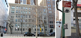
Mies’s Apartment House in Chicago


Pictured above is the Chicago apartment house of the great twentieth century modern architect, Ludwig Mies van der Rohe (1886–1969). Apparently Mies occupied the third floor. When he died in 1969 the New York Times ran this obituary which describes Mies’s place: 
For a man so modern in his conceptions, he had more than a touch of old-fashionedness. It showed up in such things as the gold chain across his waistcoat, to which was attached his pocket timepiece. Rather than live in a contemporary building or one of his own houses—he briefly contemplated moving to a Mies apartment but feared fellow tenants might badger him—he made his home in a high-ceilinged, five-room suite on the third floor of an old-fashioned apartment house on Chicago’s North Side. The thick-walled rooms were large and they included, predictably, a full kitchen with an ancient gas range for his cook.

The apartment contained armless chairs and furniture of his own designs as well as sofas and wing chairs—in which he preferred to sit. The walls were stark white; but the apartment had a glowing warmth, given off by the Klees, Braques and Schwitterses that dotted its walls. Paul Klee was a close friend, and Mies’s collection of Klees was among the finest in private hands.
Mies’s chairs were almost as well known as his buildings, and they were just as spare. He designed his first chair, known as the MR chair in 1926. It had a caned seat and back and its frame was tubular steel. There followed the Barcelona chair, an elegant armless leather and steel design of which the legs formed an X; the Tugendhat chair, an armless affair of leather and steel that resembled a square S; and the Brno chair, with a steel frame and leather upholstery that looked like a curved S. [1]
In addition, the Chicago Tribute Marker of Distinction (pictured above and located near the entry door) summarizes:
The master of Modern architecture and one of the greatest architects of the 20th Century, Ludwig Mies van der Rohe reshaped the skylines of America’s major cities in the 1950s, 60s, and 70s. 
In 1937, Mies came to Chicago from Berlin to be director of the Department of Architecture at the Armour Institute, now the Illinois Institute of Technology. In Germany, he had directed the Bauhaus School of Design from 1930 to 1933, closing it after Nazi threats. Though he had built only 19 buildings, he was internationally famous when he came to Chicago. At IIT through 1958, he designed the institute’s master plan and a number of campus buildings (Crown Hall model shown above). 
Mies celebrated contemporary technology and materials; under his influence, skyscraper construction switched from masonry to metal and glass. Following his credo, “less is more,” his buildings were characterized by refined designs devoid of applied ornament. Mies also applied his aesthetic to such furniture designs as the Barcelona chair.
Barcelona® Chair (1929). Designed by Ludwig Mies van der Rohe. The Barcelona Chair is a registered trademark of Knoll®, Inc. and manufactured by Knoll®; according to the original specifications of the designer. Images are courtesy of Design Within Reach.
  1. Whitman, Alden. “Mies van der Rohe Dies at 83; Leader of Modern Architecture.” On this Day. The New York Times on the web Learning Network, 19 Aug. 1969. Web. 19 Feb. 2012.

Monday, February 20, 2012

The inaugural project: week two at Thirst (3st) in Chicago


Above are letterforms for my first project with Rick Valicenti. These are “C” letterforms for a logotype design based on a systematic dot matrix grid that went from random dots of three sizes on the top left to a simpler two dot pattern. The Thirst office always seems to be in a non-stop design mode. Last week on this blog we displayed typographic work in progress for a logotype, which was based on Rick’s sketch.

Late Sunday night (02.12.12) Rick Valicenti, founder and design director of Thirst informed me of a client meeting and presentation scheduled for Tuesday afternoon, Valentine’s Day. So the pressure was on and I found the prospect exciting. The workweek began in non-stop design mode detailing logotype design variations for a Chicago printing company, which has the distinction of being the greenest commercial printer in the country, perhaps in the world. The company name consists of 12 characters and each logotype was produced with more or less random dot patterns based on a notional grid. The logotype design was based on Rick’s concept and it was labor-intensive process to generate around 15 logotype variations. While very unique, these designs ended up looking overly active. However, the design process resulted in a couple of break-through moments. One was the decision to use a smaller dot to bevel the corners to transition the sides of the letters. Another was to go simpler with just two dot sizes that seem to emphasize the regular dot matrix and suggests an electronic or technical display.

Tuesday morning began with printing the presentation sheets. This was followed by a trip with Bud Rodecker for a meeting at the Black Ensemble Theater Company where we met Valicenti to discuss Black Ensemble’s graphic communications program with founder and Executive Director, Jackie Taylor.

Thirst designed and produced a comprehensive Identity program with interior and exterior signage in 2011 for Chicago’s Black Ensemble and their very fine new building.

After that it was on to Consolidated Printing Company and Rick presented the new logotype designs. The design illustrated here was shown along with business cards and letterhead layouts. The presentation went very well with only slight adjustments needed. It’s very clear that Rick Valicenti is highly respected and appreciated for his insights by the clients he serves.

Proposed Consolidated Printing Company business card design.

Rick considerately had asked the client if I could be given a tour of this remarkable print facility while I was there. The shop is truly amazing—no uses of petroleum-based products—all “organic” chemistry, inks, and press clean up. The plant doesn’t smell anything like a normal commercial print shop and yet the printer doesn’t compromise at all on quality. The press produces exceptional print quality for even the most demanding customers.

The rest of the week I was in-house studio mode and able to work on some personal projects. Outside the office I attended Stanley Tigerman’s architecture talk titled “Displacement” at the Graham Foundation on Wednesday evening (02.15.12). Tigerman’s talk was inspirational. An architect based in Chicago, Tigerman is celebrating fifty years in architectural practice. He currently has a retrospective exhibition at the Graham Foundation, a show organized and assembled by the Yale School of Architecture Gallery.

Saturday, February 18, 2012

Team !Melk—“The New Navy Pier: Design Team Search”


An important design event…

A blue ribbon panel has selected five finalists vying for “The New Navy Pier Project: Design Team Search.” The displays of each design team are currently on view at the Chicago Architectural Foundation located at 224 S. Michigan Avenue. !Melk, HOK and UrbanLab invited Thirst to be a member of Team !Melk as the graphic communications consultant. On Monday evening one of the finalists, namely Team !Melk, will conduct an open colloquium. The gathering will be a conversation with members of the Team focusing on their Great Pier collaboration. The event will be held on 20 February from 6 to 7:30 p.m. at AIA Chicago, 35 East Wacker Drive / Suite 250.

Members of Team !Melk are: !Melk / UrbanLab / HOK / Thirst / Terry Guen / Zoë Ryan / Conservation Design Forum.

Friday, February 17, 2012

Architect Stanley Tigerman: The Anti-Cruelty Society Building in Chicago


The Anti-Cruelty Society (Humane Society) building was designed by Stanley Tigerman in 1979 and construction was completed in 1981. The structure is located in Chicago on the southwest corner of N. LaSalle Drive and W. Grand Avenue. The building’s exterior surface was replaced in 2011, however, much of the integrity of Tigerman’s initial design has been maintained. Pictured above: east elevation showing “a friendly face” and the view looking southwest showing the block long series of structures that comprise the ACS. (click on the images for a larger view)

Tigerman (b.1930), who’s a brilliant architect, has practiced in Chicago for fifty years—he is primarily interested in the paradoxical aspects of the idea and the reality of architecture. In other words as he says, “I’m interested in the field of architecture as distinct from the profession of architecture.”[1] He has also said that, “architecture is making the useful artful”[2] which is a phrase that could describe most design areas. Currently Tigerman has a major traveling retrospective exhibition of his work that’s on display at the Graham Foundation in Chicago. The show was organized by the Yale School of Architecture Gallery and curated by Emmanuel Pedit. Over the years Tigerman has designed and implemented many highly thoughtful, socially responsible projects for an international clientele.

Yale architecture professor, Emmanuel Petit expresses this insight about Tigerman’s work:
Tigerman insists that architecture is fundamentally relational and allegorical.… In a project for the Anti-Cruelty Society in Chicago (1979), Tigerman interpreted the urban animal shelter alternatively as a ‘killing machine’ and an Animal Cracker box.[3]


In addition, shown in this view along Grand Avenue are Anti-Cruelty Society 
buildings, from left to right: representing the Postmodern period, designed by Tigerman, the 1933 edifice representing Chicago World’s Fair Moderne and the International Style Modern of 1953. It’s fascinating to see this sequence of structures—each one signifies a specific style in architectural history during the last half of the twentieth century.
  1. Tigerman, Stanley. “Displacement.” Graham Foundation. Chicago. 15 Feb. 2012. Address.
  2. “Architect, Stanley Tigerman.” Chicago Tonight. PBS. WTTW, 13 Feb. 2010. Television.
  3. Petit, Emmanuel. Ceci n’est pas une rêverie: The Architecture of Stanley Tigerman. New Haven: Yale School of Architecture, 2011. n. pg. Print.

Wednesday, February 15, 2012

The Graham Foundation for Advanced Studies in the Fine Arts


It’s interesting that the Albert F. and Elsa S. Madlener House (1901) in Chicago is just a couple of blocks away from the Charnley–Persky House (1891). Both are rather dissimilar compared to other more “Victorian” residences in the Gold Coast neighborhood—both houses were constructed a decade apart. Perhaps the architect, Richard E. Schmidt designed the Madlener House in the Prairie Style idiom as an acknowledgement and admiration of Louis Sullivan’s Charnley House. A solid brick facade with minimum ornamentation and “classical” exterior characterizes both residences. However, the entry door of the Madlener House is charmingly off-center. Certainly, you need to get inside a building in order to fully understand it.

The Madlener House Chicago Landmark plaque summarizes:
The clarity, simplicity, and order of the Madlener House make it an outstanding residence in the tradition of the Chicago and Prairie Schools of architecture. It has the massing, logic, and dignity of a Renaissance Revivial-style palace, yet it is a thoroughly modern design.  
The Graham Foundation purchased the building in 1963 for Advanced Studies in the Fine Arts, an educational institution. Elaborating about the history of the facility the Graham Foundation website reads:
Since 1963, the Graham Foundation has been located in the Madlener House, a 9,000 square foot Prairie-style mansion located in the historic Gold Coast neighborhood of Chicago. The work of architect Richard E. Schmidt and designer Hugh M. G. Garden, the house was built in 1901–02 for Albert Fridolin Madlener and his wife Elsa Seipp Madlener, both of whom came from prominent pioneer Chicago families that emigrated from Germany in the 1850s. In its compact, cubic massing the house is related to the German neoclassical work of Karl Friedrich Schinkel and his followers in Berlin, but in many of its details it clearly reveals the influence of Louis Sullivan and Frank Lloyd Wright.

Sunday, February 12, 2012

A week of settling in: Sabbatical at Thirst (3st)


I’ve recently started a three-month Sabbatical at Thirst, which is a collaborative design office based in Chicago. My first project is developing a logotype consisting of eleven characters for a Chicago printing company. Each “dot matrix” letter is based on a 4x5 grid system. Shown above is the character “C” based on a sketch by Rick Valicenti.

It’s been about twenty years since Rick Valicenti, principal of Thirst, and I have talked in person—so last week it was great to see each other again. Rick embraced me and the entire staff was indeed welcoming. Besides Rick, the rest of Thirst’s office comprises a team of very talented, smart and witty young designers; the oldest is perhaps just over thirty years old. I was reminded of this last Wednesday when I was cordially invited to join the group for lunch (a couple of them were celebrating birthdays). As we entered the Taco restaurant on N. Damen Ave., all of them were carded accept myself with the gray hair—Rick joined us a little later. I certainly felt honored to be invited and appreciated being included. All of the Thirst team members are exceptionally fine young people.

Back at the office, after the birthday lunch break, Rick asked if I’d like to work on a “no pressure” project… (needed by 02.14) and I readily agreed. Valicenti explained the project, which involves developing logotype for a Chicago printing company (one of the “greenest” printing companies in the country). Rick always details his instructions with sketches like the one pictured above. My job is to translate and implement his drawing by utilizing Adobe Illustrator to construct each letterform as components to eventually develop the entire logotype.

So far the Thirst experience in Chicago has been busy, challenging and rewarding at the same time. Valicenti is indeed a typographic master.

Thursday, February 9, 2012

Louis H. Sullivan: “The James Charnley House”

From top-down: west facade, detail: entry door, and north facade

The James Charnley House in Chicago, just a couple of blocks from where I’m staying this semester, was designed by Louis H. Sullivan in collaboration with Frank Lloyd Wright in 1891 and built in 1892. The Charnley-Persky House (as it’s now known) is located in the Gold Coast neighborhood of Chicago and is designated a National Historic Landmark. The home is an important work in the development of modern residential architecture.

Dr. Paul E. Sprague writes a concise summary about Louis Sullivan’s modern works in his book, Guide to Frank Lloyd Wright and Prairie School Architecture in Oak Park about the significance of Sullivan’s architectural design:
… it is Sullivan’s role as inventor of the first modern architectural style in America and as leader of a younger group of radical architects [“Prairie School”] that assures him an esteemed position in American cultural history. Accordingly, it was Sullivan, not Wright, who “founded” the Prairie School of Architecture….

… Sullivan achieved the goal of a modern style by largely ignoring the precedents of historic buildings. Instead he based their masses, shapes and details on the abstract forms of plane and solid geometry. His architectural ornament, by contrast, was based both on geometric shapes and stylized plants. In keeping with his academic American and French training. Sullivan’s modern style was one of monumentality in composition and formality in planning.  
Sprague seems to capture the essence of the design elements of the Charnley House. In fact, Frank Lloyd Wright acknowledged that the Charnley House was the “first modern house in America.”
  1. Sprague, Paul E. Guide to Frank Lloyd Wright and the Prairie School Architecture in Oak Park. 2nd ed. Oak Park, Illinois: Village of Oak Park, 1978. 8-9. Print.

Tuesday, February 7, 2012

Getting the lay of the land: Sabbatical at Thirst (3st)


I’m undergoing a concerted effort getting acclimated to using Chicago public transportation and living in an urban environment. After arriving at Thirst’s office on 1440 West Hubbard Street (also home of the Richard Wright Auction House) the morning session began with initial introductions to the Thirst’s design team: Rick, John, Bud, Robyn, Tinne, and Baozhen Li. I was given an office tour.

The office layout is a functionally integrated “great room” space with enough room for each designer’s workstation and a general conference table. The designer workstation areas includes additional table surface to spread out various project elements without being separated from each other by walls and partitions. The open floor plan functions as both as efficient workflow and metaphorical openness between design team members. A dark curtain wall that’s drawn to hide storage areas separates the utility area, which is a strip of space. Occasionally, but not distracting, are muted conversations, phone conversations, conference calls, and white noise also fill the studio space.

The first day I job shadowed principal, Rick Valicenti. Rick reviewed various projects and work in progress with designers. Today was a fine beginning into discovering the culture of Thirst and just how integral Valicenti is with the other designers in the overall Thirst’s design process. These one on one interaction between Rick and individual designers results in an effective team strategy. Rick’s design thinking seems most responsive in the form of notes and sketches on ubiquitous yellow paper organized throughout the office.

Photo of Rick Valicenti’s friendly yellow paper sketches and notes.

Today Thirst’s designers were working with clients from Los Angeles and Chicago. Projects include: Identity project for an engineered architectural and sculptural water features, a sample binder and multi-page brochure, a website for one of Chicago’s premier musical arts organizations, and architectural and retail signage.

Sunday, February 5, 2012

a nice view from my room in Chicago


For those who may be following my whereabouts — this is a view (looking southeast) from my small apartment in Chicago. The move to Chicago went well and tomorrow morning, 6 February, I'll begin my Sabbatical time at Thirst (3st). I’m grateful to Dordt College and Rick Valicenti of 3st for this wonderful opportunity.

Friday, February 3, 2012

Pattern of Relationships: What’s in a Brand Name


This is a nicely arranged section from the Walker Art Center’s Graphic Design: Now in Production exhibition. Pictured, starting at left and moving clockwise are: Trevor Paglen’s, “Symbology” (United States Army Heraldry Embroidered Insignias); Dexter Sinister’s, “(We Would Like to Share) Some Thoughts on a Possible School Badge,” Neon Sign; partial collection of Christophe Szpajdel’s hand-drawn “Death Metal” logos.

This is copy from the wall documentation:
—Branding
Brands identify everything, helping to distinguish one thing from another in an otherwise crowded marketplace. Although branding is most often associated with businesses and corporations, it can also be found throughout society—from secret military groups to black metal band. More than just a logo, a brand also consists of a larger visual and verbal identity as well as the perceived values that both define and set apart an organization, a community, or even an individual.

Graphic designers not only help create brands, but also have taken on the subject of branding in self-initiated projects that document lost logos of the past, turn themselves into brands, or scrutinize the latest corporate makeovers in online forums. Innovative branding programs, particularly for cultural organizations, have pushed the boundaries of traditional identity design by creating flexible and variable systems and new tools for implementation.

Blogs and social media have stimulated public conversations about new branding campaigns, bringing individual consumers closer to companies and organizations. Facebook, the largest social media community, has emerged as a new kind of branded transnational agent, with more than 800 million users worldwide.