

Early Morning Rehoboth
Shelby Zomermaand
4-color linocut on Hosho paper
9 x 12 inches
Showing posts with label illustration. Show all posts
Showing posts with label illustration. Show all posts
Friday, May 5, 2017
Dordt College student work in printmaking—Shelby Zomermaand: “Early Morning Rehoboth”

Saturday, May 7, 2016
Dordt College graphic design and printmaking student: Christina Chahyadinata (Crissy) from Jakarta (Tangerang), Indonesia

Christina Chahyadinata
Courage
Linocut 2016
9" x 12"
Christina Chahyadinata (Crissy) is a sophomore student from Jakarta (Tangerang), Indonesia. Crissy has the heart of a christian servant. This is her first linocut print and indicates her dexterity of hand-lettering and her ability to orchestrate the integrality of text and image. A Polynesian image of tropical and verdant flora…
Wednesday, May 4, 2016
Dordt College printmaking student: Lance Wunderink, Lima, Peru

Lance Wunderink
Hidden Mystery
Linocut 2016
24" x 24"
Wunderink is a senior and graduating with a double major in graphic design and digital media production.
Tuesday, February 9, 2016
Anne and Paul Rand's: “Listen! Listen!”

Listen! Listen! An inside spread.
A children’s book by Ann Rand and illustrated by Paul Rand
Copyright ©1970 Harcourt, Brace & World Book. Photograph of the spread is from the book collection of Dordt College Library’s Learning Resource Center.
Monday, May 11, 2015
“Material Steps” — a hand cut and paste photographic collage

Material Steps
David M. Versluis © 2015
16" w x 20" h
2015
Mixed media
Material Steps comprises hand-cut and paste collage techniques made from various RC paper photographs taken earlier this year by Versluis. The collage combines gray and hot pink spray paint with other markings using lithographic crayon. All the elements are mounted to illustration board.
This piece reconsiders the metaphor of the ladder not as steps to heaven, but as doorsteps signifying the material and substance of our place on earth. Through the playful act the conventional photographic film images have been sliced into segments that are carefully reorganized to imply an informal structuring. The composition seems to imply a kind of evocative ambiguity. In other words, does the repositioned hand railing symbolize a broken ladder or molecular model?
Wednesday, May 14, 2014
Corita Kent: “Mary’s Heart”

Corita Kent (Sister Mary Corita)
May Mary's Heart Immaculate be Forever Praised (1960)
Silkscreen
Dimensions: 7.75" x 10.5"
photograph by versluis
courtesy of the Corita Art Center, Los Angeles
Luke 1:46-55
Mary’s Song:
My soul glorifies the Lord
and my spirit rejoices in God my Savior,
for he has been mindful
of the humble state of his servant.
From now on all generations will call me blessed,
for the Mighty One has done great things for me—
holy is his name.
His mercy extends to those who fear him,
from generation to generation.
He has performed mighty deeds with his arm;
he has scattered those who are proud in their inmost thoughts.
He has brought down rulers from their thrones
but has lifted up the humble.
He has filled the hungry with good things
but has sent the rich away empty.
He has helped his servant Israel,
remembering to be merciful
to Abraham and his descendants forever,
just as he promised our ancestors.
New International Version (NIV)
Sunday, September 30, 2012
“The Artist’s Studio” by Franklin McMahon

The Artist’s Studio by Franklin McMahon (1921-2012), ink on paper.
Illustration is taken from American Artist magazine, “Drawn Directly with Brush and Ink,” April 1956. 54.
Franklin McMahon’s artwork relies on a strong lyrical and personal story for impact, which makes his illustrations fine art. His direct drawing approach and spontaneous contour lines develop work that seems to breathe—one can almost feel McMahon’s compositions inhale and exhale. McMahon, who died this year (March 3, 2012) was an internationally known artist-reporter and illustrator from Lake Forest, Illinois.
By accentuating straight lines and angles McMahon’s illustrations are more than objective renderings. His unique and idiosyncratic style seems like a synthesis of hand-drawing with lens distortion without using the camera.
Tuesday, May 15, 2012
Jindřich Heisler: Surrealism under Pressure


Jindřich Heisler (Czech, 1914–1953)
Alphabet, 1952; the letter A
Collage of woodcut reproductions on wood
The Art Institute of Chicago
Select image for a larger view
The Art Institute of Chicago currently is hosting a wonderful exhibition titled, Jindřich Heisler: Surrealism under Pressure. The exhibition is on display in the Photography Galleries 2–4 until 1 July, 2012. Included in the show, as stated by the Art Institute, “is a marvelous alphabet of wooden letters, faced with glued-on xylographic montages reminiscent of Max Ernst.” Heisler collaged images to approximately .125 inch (3.175 mm) plywood and very carefully cut out the shapes. The exhibition curator explains the piece as follows:
Alphabet, Heisler’s magnum opus, is also likely his last extant work. The 25 exactingly designed plywood cutouts (the letter W is not part of Czech and French orthography), covered on one side in 19th-century woodcut reproductions, are both playful and haunting. Each depicts an intricately crafted scene of mystery and violence, and many feature demonic encounters. Heisler apparently used the letters for occult games, such as a version of tarot that involved composing his friends’ names and “reading” the stories they yielded. French Surrealist colleague Robert Benayoun may have had Alphabet in mind when he recalled at Heisler’s death his “inner sense for graphic harmony,” and André Breton used six of the letters to form the word absolu (absolute) at what proved to be the last Surrealist exhibition in Breton’s lifetime, in 1966.Read More......
Thursday, January 12, 2012
Oded Ezer: “Biotypography”—imaginative discovery rather than pragmatism

The pieces shown above (top) Tipografya poster, 2003 and Helvetica Live! poster, 2008 were designed by Oded Ezer of Tel Aviv. Currently, the posters are included in an exhibition titled, Graphic Design: Now in Production, which is on display until 22 January 2012 at the Walker Art Center, Minneapolis. Here’s an observation of the Walker exhibition catalog by Rick Poynor.
The “Tipografya” poster showcases the Frankrhulia type design, which is motivated by the adaptation of the classic Berthold’s “Frank Ruehl” Hebrew font. Ezer’s poster features the logotype for the Hebrew word for typography. Oded’s letter designs carry on the very fine Hebraic typography tradition. Traditional Pentateuch Hebrew typography fully appreciates the design elements of the letter, the word, and the book. Perhaps the essence of Hebrew type design is artistry that concentrates, like the Psalmist, “the inner soul of the poet and musician.” [1]
Oded has coined the term Biotypography in reference to the organic nature and “bio”-diversity of his typographic work. Paola Antonelli writes about this synthesis of art and science:
Ezer thinks that since, very often, a type designer chooses a typeface for its ability to embody and render the feeling of a project, the step from object to creature is direct and typefaces should really become living, biological beings. As he explains it, “The term Biotypography refers to any application that uses biological systems, living organisms, or derivatives thereof to create [to make] or modify typographical phenomena.” [2]Ezer’s beautifully eccentric typographic designs are mainly about the impact of visual form and expression. The compelling detail in his work are the accentuated appendages that simulate moving legs and antennae. These posters also allude to the mutual feature of ubiquity suggested by the “Frank Ruehl” Hebrew text font style and the font Helvetica. Both are still widely used today. Although unintentional, it’s fascinating how one’s reflection faintly merges with the framed glass of the pieces that are in the Walker exhibition.
- Antonelli, Paola. “The Typographer’s Guide to the Galaxy.” Design Observer: Observatory. Ed. Michael Bierut, William Drenttel, Jessica Helfand, Julie Lasky, and Nancy Levinson. The Design Observer Group, 16 June 2008. Web. 11 Jan. 2012. Here’s the link.
- Ibid.
Monday, September 5, 2011
Dordt is showing the 2011 “Book It!” show from AIGA Nebraska

Photograph by Aanna Stadem © 2011
Cover designer credits from left to right: Lewis Carrol’s “Alice in Wonderland” (© Emily Yoble); Franz Kafka’s “Metamorphoses” (© Peter Morris); Herman Melville’s “Moby Dick” (© Peter Morris)
The following copy is from the Dordt College public information office:
SIOUX CENTER, IA – “Let’s face it folks: as designers, we might not always take time to read all the copy, but our heads generally swivel to see great cover graphics,” said a recent article by the American Institute of Graphic Arts (AIGA) Nebraska. Because great book cover designs should be celebrated, Dordt College is hosting Book It!, a graphic design competition and exhibition hosted by AIGA Nebraska showcasing the best book cover designs.Read More......
The exhibit will be on display now through October 10 in the entrance to the Dordt College Ribbens Academic Complex.
Cover designs on display have been judged as the top 15 picks by the panel of judges, all of whom are established graphic designers, including Rodrigo Corral of New York City, Roberto de Vicqu de Cumptich of New York City, and Bryony Gomez-Palacio of Austin, Texas.
Also on display in the Dordt College Campus Center Art Gallery is the famous Herman Miller Summer Picnic poster collection featuring the work of Steve Frykholm. The gallery is open from 7 a.m. to 10 p.m.”
Saturday, August 27, 2011
Risk: Street Art Chic

The “RISK” tag from his installation wall piece for the Art in the Streets exhibition at the MOCA’s Geffen Contemporary in Los Angeles. The show completed its run at the museum on August 8. photograph by versluis, 2011.
From illegal graffiti to the merger of a commercial art brand and gallery art — Risk’s personal and compelling lettering style is from the heart. And his paintings express an energy that achieves high visual impact. Earlier this year the Los Angeles Times did an interview with Risk:
Risk helped to import Wild Style graffiti, with hard-to-decipher, [bubbly forms and] interlocking letters, from the New York subways to the L.A. freeways. At the Geffen, the artist takes over part of a wall inside and has parked a salvaged bus, painted in fiery colors, outside.…
At 43, Risk represents another generation, but these artists share something in common. They have all witnessed their rebellious, adolescent gestures become a popular activity — and big business. They’ve seen their own art and their colleagues’ migrate into fine art galleries on the one hand and onto clothing, advertising and entertainment on the other.… [1]
- Finkel, Jori. “Risk, more of L.A.’s street art pioneers paint a colorful history.” Los Angeles Times 10 Apr. 2011. Web. 27 Aug. 2011.
Monday, August 8, 2011
Steve Frykholm: Herman Miller Summer Picnic Posters (1970-1989)—Dordt College Campus Center Art Gallery


above: Steve Frykholm, courtesy of Herman Miller, used with permission
below: Show installation photograph by versluis, 2011
The Dordt College Campus Center Art Gallery (the department of art and design) proudly presents the exhibition:
Steve Frykholm, serigraphs
Herman Miller Summer Picnic Posters, 1970–1989
August 1 – October 2
On display are 20 posters from the Roger and Jeanne Knop collection, Muskegon, Michigan.
Herman Miller (located in Zeeland, Michigan) is known for their innovative furniture designs. Each year a poster is designed to promote the Herman Miller annual company picnic. This exhibition features, chronologically, the first twenty posters, which were designed by Steve Frykholm. The first poster, designed in 1970, started this wonderful series of serigraphs (silkscreen prints) and graphic design. The posters feature super-sized items like ice cream cones, cake, and fruit to illustrate the summer picnic theme. Several of Frykholm’s Summer Picnic posters are in the permanent collections of New York’s Museum of Modern Art (MoMA) and the Smithsonian, Washington DC.
Steve Frykholm has worked for Herman Miller for over 40 years. He is the creative director and vice president of design for the National Design Award-winning furniture company. In an illustrious career he has worn many hats: designer, art director, artist and client. His work has been widely published and has been included in exhibitions at the Museum of Modern Art, Cooper-Hewitt National Design Museum and Danish Museum of Decorative Art. In 2010 he was awarded the AIGA Medal, which is the AIGA’s highest award.
Friday, August 5, 2011
Chaz Bojórquez: calligraphic graffiti and art

Chaz Bojórquez, (b. 1949, Los Angeles; lives and works in Los Angeles)
Tres Placas (Three Tags), 2011
Acrylic paint on wall (Courtesy of the artist)
photograph by versluis, 2011
Art in the Streets exhibition at The Geffen Contemporary at MOCA.
Closes August 8, 2011.
This is copy from the show documentation tag for this piece:
Tres Placas (Three Tags) is a three-layered tag that represents an evolution of my letter styles. The first layer, in light grey, is my name written in an early style representing the past. The second layer, in dark gray, marks the streets in my neighborhood where I first tagged. The top layer tag, in black, is written in my current letter style, stating “Los Locos de Cali” (“West coast crazies”) because we are crazy for living the life. —Chaz BojórquezThis is an excerpt from the exhibition brochure:
The graffiti styles that emerged fro the American housing projects, subway yards, and bleak suburban parking lots during the 1970s form the foundation for what is possibly the most influential art moment since Pop—one that continues to thrive forty years after it began.Interestingly, I’ve seen examples from “artists” in this show (Barry McGee for instance) on railcars passing through Sioux Center, Iowa. Read More......
Tuesday, May 24, 2011
The Paris Book Fair at the Porte de Versailles

Upper right, clockwise: 2011 brochure cover design with the new “typographic” logo signifying the new Fair format. Below the brochure cover is the “mascot” symbol/logo that was used on the 2010 Salon du Livre de Paris street banners, which lined both sides of the Avenue des Champs-Élysées. Book publishing still lives. Street banners photograph © versluis 2010.
Saturday, February 26, 2011
Andy Warhol and the parodic model

The Dordt College 2011 Annual Junior Art Show poster was designed by Ellie Dykstra and others with photography by Annemarie Osinga.
This year’s Junior Art Show poster is an imaginative parody of the parody by referencing Pop artist Andy Warhol’s reproduction of media stars. It may seem obvious, but the art show poster is based on the parody of multiples in Warhol’s Hollywood imago pieces of the 60s and 70s, which he serigraphed photos taken from glossy magazines. The junior students are using pseudo serigraphy from Adobe Photoshop, but I enjoy the colors and density of typed information in the poster layout. In addition, what I appreciate about the Dordt Student’s poster is expressed by the tongue-in-cheek attitude and bright toothy smiles that critique and mimic Warhol’s work but without the mockery, which seems to characterize much of postmodern art parody. The poster is filled with signs of life, energy, and enthusiasm without the inanimate vacuity sometimes associated with Warhol’s Pop art. [1]
This year’s Junior Art Show poster is an imaginative parody of the parody by referencing Pop artist Andy Warhol’s reproduction of media stars. It may seem obvious, but the art show poster is based on the parody of multiples in Warhol’s Hollywood imago pieces of the 60s and 70s, which he serigraphed photos taken from glossy magazines. The junior students are using pseudo serigraphy from Adobe Photoshop, but I enjoy the colors and density of typed information in the poster layout. In addition, what I appreciate about the Dordt Student’s poster is expressed by the tongue-in-cheek attitude and bright toothy smiles that critique and mimic Warhol’s work but without the mockery, which seems to characterize much of postmodern art parody. The poster is filled with signs of life, energy, and enthusiasm without the inanimate vacuity sometimes associated with Warhol’s Pop art. [1]
This poster, besides being fun, is also about the relationship of images and their originals.
- Kearney, Richard. The Wake of Imagination. London: Century Hutchinson Ltd. and Routledge, 1988. 254-397. Print.
Sunday, February 6, 2011
Quotations on creativity — Henry Wadsworth Longfellow
Art is the gift of God, and must be used
Unto His glory.…
—Longfellow
This quote is found in a dramatic lyrical poem by Henry Wadsworth Longfellow entitled, Michael Angelo. Longfellow’s illustrated book was published in 1884.
Longfellow, Henry Wadsworth. Michael Angelo. Boston: Houghton, Mifflin and Company, 1884. 25-26. University of California Libraries/California Digital Library. Web. 5 Feb. 2011.

Head-Piece engraving from the book; S.L. Smith, illustrator. p.7
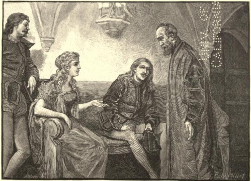
A scene from the poem: “A Chapel in the Church of San Silvestro. Vittoria Colonna, Claudio Tolommei, and others.” The noblewoman, Vittoria Colonna has received the Pope’s blessing to build a new convent. Caption: Vittoria Colonna, Michael Angelo, and others. In the Chapel of San Silvestro. “If friends of yours, then are they friends of mine. Pardon me, gentlemen. But when I entered I saw but the Marchesa.” Book engraving was illustrated by F. D. Millet. p. 23
The scene begins as the building committee is meeting with Michelangelo. The scene unfolds with Vittoria and Michelangelo discussing the design of the convent. Here are passages from pages 25 and 26 that reveal Longfellow’s quote (I’ve used bold face for emphasis):
Vittoria.Soli Deo Gloria Read More......
But that
Is not what occupies my thoughts at present,
Nor why I sent for you, Messer Michele.
It was to counsel me. His Holiness
Has granted me permission, long desired,
To build a convent in this neighborhood,
Where the old tower is standing, from whose top
Nero looked down upon the burning city.
Michael Angelo.
It is an inspiration!
Vittoria.
I am doubtful
How I shall build; how large to make the convent,
And which way fronting.
Michael Angelo.
Ah, to build, to build!
That is the noblest art of all the arts.
Painting and sculpture are but images,
Are merely shadows cast by outward things
On stone or canvas, having in themselves
No separate existence. Architecture,
Existing in itself, and not in seeming
A something it is not, surpasses them
As substance shadow. Long, long years ago,
Standing one morning near the Baths of Titus,
I saw the statue of Laocoön
Rise from its grave of centuries, like a ghost
Writhing in pain; and as it tore away
The knotted serpents from its limbs, I heard,
Or seemed to hear, the cry of agony
From its white, parted lips. And still I marvel
At the three Rhodian artists, by whose hands
This miracle was wrought. Yet he beholds
Far nobler works who looks upon the ruins
Of temples in the Forum here in Rome.
If God should give me power in my old age
To build for Him a temple half as grand
As those were in their glory, I should count
My age more excellent than youth itself,
And all that I have hitherto accomplished
As only vanity.
Vittoria.
I understand you.
Art is the gift of God, and must be used
Unto His glory. That in art is highest
Which aims at this. When St. Hilarion blessed
The horses of Italicus, they won
The race at Gaza, for his benediction
O’erpowered all magic; and the people shouted
That Christ had conquered Marnas. So that art
Which bears the consecration and the seal
Of holiness upon it will prevail
Over all others. Those few words of yours
Inspire me with new confidence to build.
What think you? The old walls might serve, perhaps,
Some purpose still. The tower can hold the bells.
Michael Angelo.
If strong enough.
Vittoria.
If not, it can be strengthened. …
Wednesday, February 2, 2011
Reminiscences about “Plucked Chicken Press” — founded in 1978 by Will Petersen and Cynthia Archer — specializing in lithography

Front and back of the Plucked Chicken Business Card, c.1980 — from the collection of David Versluis
One afternoon, perhaps in the fall of 1980, while researching art internship sites for students at Trinity Christian College, Palos Heights, Illinois my colleague Jake Van Wyk and I visited Plucked Chicken Press and met with Will Petersen to discuss the possibility of providing a student internship. Cynthia Archer was there to greet us as well as we entered the workshop, which was housed on the second floor of an old industrial building. Petersen was professional and friendly and with a sense of humor — he was a genuine character. We were impressed with his collection of lithographic stones. The press was located in downtown Chicago just west of the fork in the Chicago River.
Along with the “Plucked Chicken” logo and printer’s mark — the business card design is based on the printmakers numbering system, which is a good way of recognizing a limited edition original art print. Usually, but not always, for authentic prints the artist signs their name in the bottom right-hand corner on the front just below the image. On the bottom left corner opposite the signature the artist writes the number of each print in the edition. So, for example, a print numbered “3/30” signifies that it is the 3rd print out of 30 in the print run.
As published in the current Plucked Chicken Press website (courtesy of Oakton Community College, Skokie, Illinois) here’s a nice synopsis about the origins of the Plucked Chicken logo:
Plucked Chicken — The Journal and the Logo:Read More......
Plucked Chicken, a journal of art and poetry, was founded in Morgantown, West Virginia, in 1977. The Chicago poet and writer, Effie Mihopoulos, provided a glimpse of the journal’s birth in an April 1981 Serials Review:
The magazine was started because Petersen just having quit his teaching job [at the West Virginia University] (at 49) and feeling like a plucked chicken, had boxes and boxes of notes, letters, prose and other miscellanea that needed sharing, an outlet. He had a strong editorial background ranging from work with mimeographed magazines in grade school to [poet] Cid Corman's second Origin series; he was also associated with Bussei, which published [poet] Gary Snyder's first poems and [writer] Jack Kerouac's first haiku. Working with shapes one day, Petersen and his wife [Cynthia Archer] came up with one the size of a postage stamp that they liked — it looked like a plucked chicken, and since it seemed symbolic of the artist (a bird that can't fly, ready for the stew or to be barbecued, all goose bumps and no feathers), the name stuck.
The journal ended in 1980 with issue number six when Petersen and Archer moved to Chicago, but the name and logo continued to identify the press they had founded in 1978. Every print published by the Plucked Chicken Press was embossed with this logo.
Thursday, January 13, 2011
Illustrator George Akimoto and the early days of “Communication Arts (CA)” magazine

This is the October, 1961 cover for CA, The Journal of Commercial Art and Design, which features the concept spacecraft and outerspace illustration by the late George Akimoto (American). From the collection of David Versluis.
In the book Graphic Design Time Line the authors write that in 1959:
“Communication Arts (CA) magazine is founded in San Francisco, California, by Dick Coyne and Bob Blanchard. Coyne is editor and designer. Freeman Craw designs logo. It began as The Journal of Commercial Art, but was called CA.” (1)
The context of the space theme for the CA cover, in 1961, probably relates to President John F. Kennedy’s special message on urgent national needs, which he delivered earlier that year before a joint session of Congress on May 25, 1961. In his message, Kennedy issued the challenge and goal of sending a man safely to moon and back by the end of the 60s decade. During the speech the President stated, “First, I believe that this nation should commit itself to achieving the goal, before this decade is out, of landing a man on the moon and returning him safely to the earth. …”
(1) Heller, Steven, and Elinor Pettit. Graphic Design Time Line, A Century of Design Milestones. New York: Allworth Press, 2000. 144. Print.Read More......
Tuesday, January 4, 2011
An AIGA visitor: Paul Berkbigler

Copyright for artwork and poster belongs to P.Berkbigler Design & Illustration © 2011.
The amazing Paul Berkbigler will be visiting Dordt College. As Paul says, “to talk about his life on the lamb as an escaped designer and illustrator working independently in the Midwest on projects across America. This event will offer you insights about the brave new world of working virtually from somewhere awfully close to your own living room.”
Join us in the Department of Art and Design Lobby from 4–5:15 p.m. on Wednesday, January 12 for an open Q&A session. This will be a chance to hear about how AIGA can directly help you.
Paul is a full-time, independent owner, proprietor and general honcho at P.Berkbigler Design & Illustration, which is based in Lincoln, Nebraska. Berkbigler also serves as Director of Education for AIGA Nebraska. His prior lives include: working at Studio X, a small design and illustration firm in St. Louis, Missouri, earning an MFA in graphic and interactive design at Tyler School of Art in Philadelphia, Pennsylvania, and serving as a full-time professor of design & illustration at Concordia University, Nebraska.
His professional specialties include layout & design, interactive media conceptualization, planning and implementation, motion graphic planning and creation, copy writing, play writing, editing, critical analysis, visual communication research, digital and hands-on illustration, printmaking and print process familiarity.
Friday, December 10, 2010
teaching students about linguistic and visual patterns
The literacy and visual examples shown in this blog piece all rely on patterns and spatial relationships for impact. Professor Roy R. Behrens, in his essay “How Form Functions,” has said, “literary uses of repetition and variation (similarity and dissimilarity) provide us with interesting parallels to the use of unit-forming factors in the visual arts.” Unit-forming factors (good Gestalt) which includes: similarity, proximity, continuity, and closure are things we've studied in class that give students a vocabulary to discuss how their work works.

The Herman Miller Furniture Company
Summer Picnic Poster [1970]
Sweet Corn Festival
Stephen Frykholm (American, born 1942) and Philip Mitchell
Silkscreen with lacquer finish, 39 1/4 x 25" (99.7 x 63.5 cm).
This is the first poster in the long running series… apparently Steve printed the first posters in his basement. Image from MoMA. At Dordt, one of the exhibitions we’re planning for next year will be a show of the first twenty Herman Miller Summer Picnic Posters designed by Steve Frykholm.

Listen! Listen!
A children’s book by Ann Rand and illustrated by Paul Rand
Copyright ©1970 Harcourt, Brace & World Book illustrated is from the Dordt College Library’s Teacher Resource Center
Text: Rrrroooaaarrrrr! 12–13.

Text: Listen…
It’s not too polite a thing,
But if you’ll bring
Your ear up close,
You can hear the breakfast noise
I like most.
It’s the crunch crunch
Of buttered toast.
24–25.
Interestingly, Behrens on occasion mentions Alfred North Whitehead who wrote in Principles of Natural Knowledge, “The essence of rhythm is the fusion of sameness and novelty; so the whole never loses the essential unity of the pattern, while the parts exhibit the contrast arising from the novelty of their detail.”
Particularly for art and design students, recognizing patterns is a key to discernment in visual thinking. Whether the patterns are imagined and developed by human beings or are found in the world created by God, perceiving the patterns changes our vision and we begin to see the world in a new way — as wonderful correlations.
Subscribe to:
Posts (Atom)
