

Cover image is courtesy of Bobolink Books
The subject of camouflage is multifaceted and holds a fascination for many people. For nearly thirty years Roy R. Behrens, writer, scholar, graphic designer and professor at the University of Northern Iowa, has become a leading authority on the relationship (the confluence) of art and camouflage. Professor Behrens’s newest publication, titled Ship Shape, is about World War I dazzle ship camouflage. The book is a compelling anthology of vintage essays, illustrations, and anecdotes discussing the theory of dazzle ship camouflage as a military strategy for optical confusion techniques and its correlation to art, graphic design, physics, and the natural sciences. When you looked at a dazzle camouflaged ship through the periscope of a menacing submarine you saw visual (figure & ground) ambiguity and uncertainty. Behrens is the editor and graphic designer of the book, published by Bobolink Books, Dysart, Iowa.
With this publication Behrens cleverly draws back the curtain to show readers some of the primary sources that he has referenced in his numerous public presentations and acclaimed publications on ship camouflage. This publication is the most comprehensive sourcebook about dazzle camouflage while the bibliography for further reading is impressively extensive. As Roy writes in the preface, “My own way of managing all this [material] is to pretend that I am witnessing in the pages — one could say, historically eavesdropping on — the ‘chatter’ of an era when ship camouflage was the subject of fervently heated exchanges — along with cubism, jazz, women’s suffrage, prohibition, costume parties, and baseball.” Ship Shape is specifically about dazzle ship camouflage with selections written during the World War I era. The exception to this is a delightful chapter on camouflage miscellany titled “Jazz, baseball, booze, and dazzle balls,” which is a collection, a “medley” as Behrens calls them of camouflage and popular culture. These written bits and pieces are also from the World War I period.
Obviously, when reading material from an earlier era the writing style can often highlight certain idioms and mannerisms, which now seem interestingly amusing. However, it becomes apparent in reading Ship Shape that the early pioneers of dazzle camouflage were highly motivated through their research and convictions that applying dazzle camouflage to cargo and troop ships in wartime could unquestionably help save human lives and cargo from sly enemy submarine torpedoes. Perhaps an analogy might be that the World War I camoufleurs were like the biblical character Noah who built an enormous “life boat” as a place of safety from impending doom.
As with all of Behrens’s books, Ship Shape is instructive and entertaining. As you read the essays, the editor’s comments, and look at the illustrations you will always find a new perspective. This book can be characterized by it’s many salient features. For instance, the photographs highlighting British painter Edward Wadsworth are stunning and alone are worth the cost of the book.
Tuesday, November 29, 2011
A new book release from Bobolink Books: “Ship Shape: A Dazzle Camouflage Sourcebook”
Wednesday, November 23, 2011
Philippe Apeloig, “understanding the art and design of letters”

Photographs from the Graphic Design: Now in Production show at the Walker Art Center in Minneapolis (note viewer and environmental interior reflections in the frame glass).
Top: Philippe Apeloig, designer. FIAF: French Institute/Alliance Française de New York, Crossing the Line – FIAF Fall Festival, Affiche, 100 × 150 cm, 2010. Directly above: Philippe Apeloig, [Motion] Typographie (on screen): La Lorraine, 2005.
Currently on display is a major exhibition at the Walker called Graphic Design: Now in Production — the show runs until 22 January 2012. In the exhibition catalog Ellen Lupton writes, as one of the featured essayists, a piece entitled, “The Making of Typographic Man.” Lupton’s essay correlates to the Typography area in the show, which features, among several others, the work of French graphic designer, Philippe Apeloig. As Ms. Lupton states:

Custom lettering is a powerful current in contemporary design. Designers today combine physical and digital processes to create letterforms that grow, copulate, and fall apart. Vocabularies range from the lush organicism of Marian Bantjes and Antoine et Manual to the geometric constructions of Philippe Apeloig, whose bitmapped forms suggest an animated process of assembly and dissolution. [1]However, Apeloig’s compelling typography also seems to move beyond the geometric constructions, using the motion of countless pixilated points of light that coalesce and disperse to suggest the impact of human culture in flux and crossing boundaries. Interestingly, Lupton ends her essay with these words, which contextualizes the work of Apeloig:
Unfurling today across the networked horizon, text is now mutable (changing), interactive, and iterative, no longer melded to a solid medium… an essential “natural resource” (an essential medium of text exchange in our times). [2]Indeed Apeloig’s typographic design is an image of a flourishing estuary—the ebb and flow of multifaceted cultural diversities.
- Lupton, Ellen. “2011 The Making of Typograpic Man.” Graphic Design: Now in Production. Ed. Andrew Blauvelt and Ellen Lupton. Minneapolis: Walker Art Center, 2011. 113. Print.
- Ibid. 114.
Saturday, November 19, 2011
Henk Krijger: designer of the Trinity Christian College Logo

The Trinity Christian College Symbol was designed by Henk Krijger in ca.1970. Above left: Krijger’s two-color original logo for TCC (courtesy of Peter Enneson). Right: The TCC logo in subsequent years redrawn as a one-color “blue” version.
Today, 19 November, is the anniversary of the birth of Henk Krijger, a Dutch artist and graphic designer. He was born in 1914 and died in 1979 at age 65. [1]
Trinity Christian College is located in the south Chicago suburb of Palos Heights, IL. When Dayton Castleman, a current art professor, came to Trinity he was very enthusiastic about the art of the Trinity logo. The astute Castleman saw the correlation of Krijger’s design with that of minimalist modern art. In 2008, Dayton said this about Trinity’s mark:
Regarding the logo’s uniqueness among Christian colleges, there was a recent college president that apparently disliked the logo, and added a more traditional college seal to the school’s graphic representations, but the three-bar logo is the most common, and seems to be the most easily identifiable with the school… the artist of the logo is unknown… [2]Here’s part of the story about the origin of the logo from a pretty good authority, Dr. Calvin Seerveld:
Yes, David. Trinity still uses it, and Henk Krijger designed it in 1970-71. There is probably a faculty minute on it. It was not the result of a ‘competition’ for a logo, since Krijger was our art prof (part-time) at the time. [There were efforts] to get others to produce designs (quite cluttered and old-fashioned), but failed to stop what Krijger produced at the faculty request. [3]The three rectangles within a “classical” golden section square indicates an essence of form that is usually associated with a modernist graphic design 20th century international style. The square format contrasts with the geometric triangle, which is the traditional Trinitarian symbol — perhaps Krijger’s Trinity symbol of the three-in-one concept is more theologically accurate than the triangle configuration. When a logo design has to go through a group and variety of opinions in the selection process, not always is the best design chosen. The uniqueness of Trinity’s mark is the result of great trust in the work of Krijger and the apparent distinctiveness of Trinity’s faculty and students in 1970-71. The Trinity mark is still fresh and memorable even after over forty years of use. That’s remarkable.
- de Bree, Jan, ed. Hommage à Senggih: A Retrospective of Henk Krijger in North America. Toronto: Patmos Gallery, the Henk Krijger Estate, 1988. 67. Print.
- Castleman, Dayton. “Trinity Logo – Painter Edition.” Dayton is Not in Ohio. n.p., 3 July 2008. Web. 19 Nov. 2011.
- Seerveld, Dr. Calvin. “Henk Krijger and the Trinity Christian College Logo,” Message to the author. 11 Nov. 2011. Web.
Monday, November 14, 2011
Simon Garfield’s “Just My Type”


Top: Glaser's “Stencil”, c. 1967 – this current rendition is by Linotype. Below: “Baby Teeth” originally drawn by Milton Glaser, c. 1964. Here’s the image source.
The early to late-1980s issues and arguments about using personal computers for graphic design now seem passé, but stories about how some of the great graphic designers were reluctant to use computer technology when it first came out is still interesting and amusing.
In his book Just My Type, author Simon Garfield tells a story about the time Milton Glaser and Matthew Carter ‘debated’ the use of personal computers as a type designer’s medium and tool. As Garfield writes:
I asked Matthew Carter whether computers have made the life of a type designer any easier (Carter, if you’ll recall, began life as a punchcutter in the style of a latterday Gutenberg, and has worked with practically every typesetting method since; his greatest digital hits have been Verdana and Georgia). He replied, ‘Some aspects get easier. But if you’re doing a good job you should feel that it gets harder. If you think it’s getting easier, you ought to look out. I think it means you’re getting lazy.’Ironically, it seems when you study the drawn typefaces designed by Glaser his type styles look like they could be computer generated. Just My Type, by Simon Garfield, is very good reading; it contains interesting descriptions of typefaces along with anecdotes about type designers.
When personal computers and typographic software were in their infancy, Carter became involved in a quarrel at a type conference with the designer Milton Glaser…. ‘He was very resistant,’ Carter remembers. ‘His point was that you can’t sketch with a computer, you can’t do a woolly line – everything that comes out of a computer is finished. I didn’t disagree with that, but on a computer there are other ways of sketching. All type design programs have these very crude tools that allow you to take a shape and flip and flop it and stick it here and there. And if I’m designing a typeface and I’ve drawn the lower-case b, there’s information there that I can use for the p and the q, so why not flip and flop it? It’s done in seconds, and gives me a chance to clean things up and resolve matters. And if I’ve done a lower-case n, I’ve got a lot of information about the m and the h and the u. Why wouldn’t use that? In the old days when I was drawing it, I would also use the information but it would be much more laborious. Computers are not the answer, but they’re a help.’[1]
- Garfield, Simon. Just My Type: A Book About Fonts. New York. Penguin Group/Gotham Books, 2010. 321-22. Print.
Monday, November 7, 2011
Dordt College Classroom Building Sculpture Proposal

Photography and illustration by versluis © 2011
The illustration above shows the collaborative Dordt campus sculpture proposal for the exterior wall of the Ribbens Academic Complex Building (east elevation). The piece is tentatively called “Insignia” and it’s important that the work compliments both the architecture and the existing sculpture titled “The Gift” by Van Wyk. The collaboration consists of artwork by Jacob Van Wyk along with design and illustration by David Versluis. Proposed project materials and construction is a wall-mounted substrate of individually glazed stoneware tiles.
Interestingly, regarding collaborative process, architect Frank Gehry conveys this insight:
I collaborate with people on projects because it enriches the mix and gets you somewhere else that you wouldn’t have gotten to otherwise. When it’s really working, it is like holding hands and jumping off a cliff together.[1]
- Isenberg, Barbara. Conversations with Frank Gehry. First ed. New York: Alfred A. Knopf, 2009. 155. Print.
Thursday, November 3, 2011
M.C. Escher and the Keramiekmuseum Princessehof, Leeuwarden, The Netherlands

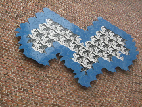
Top photograph by versluis, 2004 — Credit for the close-up photograph below it is from SmitoniusAndSonata, all rights reserved.
Pictured above are ceramic tiles on the exterior wall of the Princessehof Ceramics Museum in Leeuwarden, The Netherlands. The design is based on M.C. Escher’s 1949 woodcut titled the “Regular Division of the Plane With Birds.” The piece commemorates the fact that M.C. (Maurits Cornelis) Escher (1898–1972) was born in Leeuwarden.
Escher felt that the regular division of the plane using contiguous shapes was one of the most interesting problems he dealt with. In an essay titled “Coloured Symmetry” Prof. H.S.M. Coxeter quotes Escher as saying:
“A plane, which should be considered limitless on all sides, can be filled with or divided into similar geometric figures that border each other on all sides without leaving any ‘empty spaces’. This can be carried on to infinity according to a limited number of systems.”[1]
Escher goes on to say this about his interest in the motifs of animal shapes:
“… My experience has taught me that the silhouettes of birds and fish are the most gratifying shapes of all for use in the game of dividing the plane. The silhouette of a flying bird has just the necessary angularity, while the bulges and indentations in the outline are neither too pronounced nor too subtle ….”[2]
- Coxeter, H. S. M. “Coloured Symmetry.” M.C. Escher: Art and Science. Ed. H. S. M. Coxeter, M. Emmer, R. Penrose, and M. L. Teuber. 2nd ed. Amsterdam: Elsevier Science Publishers B.V., 1987. 15. Print.
- Ibid. 16.
