

Zandberg Family
Kevin Zandberg
Project Manager
MJSA Architecture & Interior Design
Salt Lake City, Utah
My initial interest in architecture grew out of my childhood experiences visiting different construction sites with my father. I always enjoyed watching buildings grow before my eyes as they went through the various phases of construction. Through those experiences I developed a growing interest in construction, in particular the details of how a building is put together. I spent most of my summers during my high school and college years working in construction, learning the different aspects of building from concrete work to framing, drywall and finish carpentry.
While at Dordt my path to architecture really began to take shape. After my first semester I began to revisit my earlier experiences in the construction world and my interest in how buildings are put together. I spent the summer after my freshman year contacting different architecture schools and began to formulate a core set of courses that would help prepare me for graduate school in architecture. With the assistance of Professor Kevin Timmer we charted a road map for a major and in 1992 I graduated from Dordt College with a Bachelors Degree in Individual Studies: Pre-Architecture. It’s interesting to look back at the courses I took and my experiences while at Dordt. I think we did a good job molding my major and I have always been complemented on my course selection. I also find it interesting that I never really considered leaving Dordt to enroll in a Bachelor of Architecture program at another school. I am still very thankful for the education I received and the Christian worldview from which everything was taught. The idea that we are God’s kingdom workers seeking to be God’s servants redeeming His world has become an integral part of my life and is what I continue to explore within my profession.
After working another year in construction I enrolled in Iowa State University’s Master of Architecture program and graduated in 1996. My first job in architecture was as an Intern Architect with FFKR Architecture in Salt Lake City. While at FFKR I worked on a variety of projects from a college administration building, a new concert hall for the University of Utah and a large movie theater / restaurant / business complex. It was a great first firm experience as an intern.
I left FFKR in 2000 for an opportunity to work with MJSA Architecture & Interior Design. MJSA offered me an opportunity to work in residential design working on single family and multi-family projects primarily in the role of Project Manager. During my years at MJSA I have been very fortunate to work on a number of different types of projects from single family residences, mixed-use, multi-family (new and adaptive re-use), historic preservation and higher education. My involvement in projects has typically been to assist in the development of a design response, then lead the Design Team in the production of construction documents and finally assist the General Contractor through the construction process. My favorite aspects of being a Project Manager are working out design details during the drawing phase and spending time at the job site with the General Contractor during construction, ensuring that the design intent is met.
The field of architecture is incredibly diverse, requiring knowledge of site context, building codes, construction methods, building systems, as well as requiring an understanding of the social, psychological and environmental impacts of a building. Architecture is a complex field but this complexity is also what I find rewarding. No two buildings are the same and each project challenges you with a new set of building parameters. This keeps architecture interesting and engaging for me.
Over the years several projects stand out in my mind for various reasons whether it be the social component or the preservation and adaptive re-use of an existing building. The projects include:
Life Start Village (Midvale, Utah) is a collection of new single family houses, town houses and common housing providing safe housing environments for abused mothers and children.
Francis Peak Apartments (Kaysville, Utah) was a low-income multi-family remodel project for an entity called Mercy Housing. The project focused on improving the quality of existing low-income housing apartments as well as improving the residents’ quality of life.
Artspace City Center (Salt Lake City, Utah) (see the following photos) was an adaptive re-use project. We turned a turn-of-the century retail warehouse building into artist studios and apartments:
Photograph used with permission from MJSA.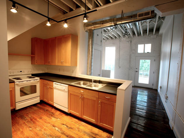
Photograph used with permission from MJSA.
Photograph used with permission from MJSA.
John R. Park Building – University of Utah (Salt Lake City, Utah) was an exterior restoration and seismic stabilization project of a 1912 building. It is also the marquee building of the University of Utah housing the president and vice-president offices. Photograph used with permission from MJSA.
Artspace Commons (Salt Lake City, Utah) is a new mixed-use development containing artist studios and low to middle income apartments. Sustainability is a key component for this project and we are attempting to achieve LEED Gold certification. Rendering used with permission from MJSA.
I am thankful for the opportunities and projects that come my way and appreciate the challenge each new project brings.
Soli Deo Gloria
Monday, August 30, 2010
Dordt Alumni in Design: Kevin Zandberg
Sunday, August 29, 2010
Quotations on creativity [improvisation]—Roy R. Behrens

Photograph by Versluis, 05.19.2010
“As mere human beings, we do not have the option of ‘creating’ things: It is not within our capacity to produce anything out of thin air. Rather, the entire range of human innovation (whether works of art and literature, design solutions, scientific discoveries, or new technologies) has come from the recombination of pre-existing components, by a process that Einstein referred to (in a famous introspective note about his own creative process) as combinatory play.” [1]
Behrens, Roy. False Colors: Art, Design, and Modern Camouflage. Dysert, Iowa, Bobolink Books, 2002. 194-195. Print.
Footnote:
- Behrens references Einstein’s quote in: Jacques Hadamard, The Psychology Invention in the Mathematical Field. Princeton, New Jersey: Princeton University Press, 1949.
Saturday, August 28, 2010
Quotations on creativity—Brewster Ghiselin

Brewster Ghiselin at a Picnic (center foreground)
Photograph credit: Brewster Ghiselin Photograph Collection
J. Willard Marriott Library, University of Utah, P0296
“Genuine creativity will always involve individual reflection…. From the point of view of consciousness, the creativity appears to arise ex nihilo [out of nothing].
… Creativity ministers to the benefit of society through the solutions of a wide variety of problems, …. But creativity also ministers to the good of the individual creative person as well, by filling that gap, that “nothing” within his own being.”
—Brewster Ghiselin
Tuesday, August 24, 2010
Pure | Modern | New | 1916 | Sioux City, Iowa

An illustration of a preliminary watercolor sketch, c 1910s, depicting the west facade of the Woodbury County Court House in Sioux City, Iowa. This sketch, drawn and painted, by William Gray Purcell seems to indicate cubist crystalline forms. Minnesota Libraries, Manuscripts Division, Northwest Architectural Archives [William Gray Purcell Job Files]

Woodbury County Court House
William L. Steele, architect
Purcell and Elmslie, associated architects
Sioux City, Iowa 1915/1916
Photographs by Versluis, © 2010, all rights reserved
Some of Prairie School architecture’s greatest accomplishments are found in the state of Iowa. Places such as Mason City, Grinnell, Algona, Cedar Rapids, and Sioux City all have very fine examples of the “Prairie Style” idiom. The largest Prairie School style public building ever built is the Woodbury County Court House in Sioux City, Iowa. The building is considered, by many, to be in the top one hundred buildings in the United States. Fundamentally, early twentieth century Prairie School design principles integrated art, craft, and technology into a relatively simple but noble geometric form.
According to Paul Goldberger, the Architecture Critic for The New Yorker, the early American architect Benjamin Henry Latrobe once said, “Simplicity is the highest achievement in art.” Latrobe also suggested that a graceful geometric style and simplicity resonates as democratic architecture because it is a form that’s more accessible to the public.


The “Sullivanesque” style bronze, tile and terra-cotta ornamentation on the Woodbury County Court House is mosaic and richly diverse. Writer Bill Menner mentions, in his book about Grinnell Iowa’s Merchants National Bank, that the magnificent terra-cotta ornament on the Court House was the work of Kristian Schneider who worked for the American Terra Cotta & Ceramic Company outside Chicago. Prairie School terracotta designs were usually intended for decoration and moved in the direction of abstraction and stylized floral patterns and rhythms. In addition, the architectonic tiles delineated linear geometries and were used to transition and harmonize corresponding masonry planes. However, the friezes and sculpture, designed by Alfonso Iannelli, are symbolic and publicly reinforce classic American icons with avant-garde geometric forms. The typographic inscription on the building reads: JUSTICE AND PEACE HAVE MET TOGETHER TRUTH HATH SPRUNG OUT OF THE EARTH.
Saturday, August 21, 2010
Quotations on creativity—Stanley Wiersma

Dr. Stanley Wiersma was a former Calvin College English professor, poet, and author who often wrote under the pseudonym Sietze Buning. Perhaps his best writings are Purpaleanie and Style and Class, which are based on auto-biographical experiences growing up in Northwest Iowa.
Stan was a Fine Arts Guild faculty mentor when, as a student, I served as chair for the Visual Arts Guild at Calvin College. Professor Wiersma, was also known for his encouragement of young Christian authors, he died suddenly in 1986 while on leave in the Netherlands.
Sunday, August 15, 2010
Homage to Lou Dorfsman / “I’m Not There” — the movie

Frame from the film “I’m Not There.”

Picture of a CBS news program advertisement designed by Lou Dorfsman, which ran in the The New York Times, Tuesday July 2, 1968. The subheadline reads: First of a seven-part series, “Black History: Lost, Stolen or Strayed.”
“I’m Not There” (2007) is a film made by writer/director Todd Haynes that speaks enigmatically of Bob Dylan’s life, poetry, performances, and music. Haynes discusses in the DVD introduction to the film that he wanted to give the audience a flavor of the 60s period through a collage of inventive and iconic juxtapositions of story and images that convey Dylan’s artistic content and convictions.
In a surreal chapter, the movie character William (Billy), played by Richard Gere, portrays one of the Dylan’s personas as outlaw/hero. The scene illustrated by the frame shown above is on screen for only two seconds and can be easily missed, but the portrait in the background has dramatic impact. An astute observer can recognize the profile as a re-creation of Lou Dorfsman’s 1968 newspaper advertisement for CBS Television news. Perhaps it’s Haynes’s gesture to Dorfsman’s skill as an important graphic designer and art director of that tumultuous 60s era.
Understanding the context of CBS’s ad is helpful as the series was broadcast in the summer of 1968 after the assassination of Martin Luther King, the race riots that followed, and the death of Robert Kennedy in early June.
The first paragraph in the ad highlights the hidden conversation: “America has camouflaged the black man. For three hundred years the attitudes of white Americans to black and black Americans to white have been subjected to misunderstandings, erasures and distortions damaging to both. The black American’s achievements have been misplaced, his contributions obscured. He has been told so often who he is not that he no longer knows who he is. And frustrations of his search for identity and recognition underlie much of today’s crisis of alienation in American society.”
Philip Meggs in A History of Graphic Design describes the 60s advertisements for CBS Television this way: “Dorfsman program ads were simple and direct, but executed with distinction” and he assembled image combinations that “carried tremendous shock value and gained viewers for important news programs.”
Thursday, August 12, 2010
Fletcher Roger Sliker: designer, baker, and coffee roaster

IDEA NO.54, 1962/8, Magazine Cover Design: Fletcher Roger Sliker.
© Seibundo Shinkosha Co., Ltd. all rights reserved. Used with permission.
“Celebration on the Grand #8” 1987 Poster, 22 inches x 34 inches. Design: Fletcher Roger Sliker. Signed bottom right—from the collection of David Versluis.
Recently, while doing research I came upon Fletcher Roger Sliker’s 1962 cover design for IDEA no.54, which was a magazine that featured advertising art. The content of this particular issue featured the following: Banking Image-Building, Graphic Design / Japan, House Style of Pirelli, Basic Training on Design, Paul Peter Piech, and Johannes Itten’s Art of Color.
The cover, which acts much like an artist’s poster, could be a section from a larger art piece. As Carlo Arturo Quintavalle has said about artist’s posters of the 1960s, “They do not pretend to be accessible to all viewers but simply to be a kind of monogram that only the initiated will understand.” Even though the two pieces are twenty-five years apart, they each show a consistent approach to assemblage. Each indicates a melding of word and image where type becomes picture and vice versa. Interestingly, the 1987 poster is publicly accessible, which is perhaps due to twenty-five years of viewers becoming more visually sophisticated.
Roger Sliker and I became acquainted around 1980 when I became interested in the products and corporate culture of Steelcase Inc. Sliker was the manager of graphic design for the company at the time, and he was very interested in the collage pieces in my portfolio. He suggested that I needed further experience and he thought my work had an affinity with the design of Armin Hofmann. He also suggested that I needed to read George Nelson’s thoughts about design. Sliker, always well read, is an astute cultural observer and we shared a common interest in Thomas Merton and kaleidoscopes. Roger was incredibly generous with his time.
Roger Sliker was a very important person in my design development and a role model. On an administrative level Roger always had a high place at the discussion table where his insights, critique, and counsel became very important project contributions. A graphic design colleague once proclaimed that Roger was “the poet laureate of Steelcase.”
Roger Sliker portrait and the Raging Sage store signage.
A memorable project for some of my former students at Trinity Christian College occurred in 1984 when I invited Roger Sliker, the corporate graphic design manager and Rick Valicenti, a Chicago designer to the college for a delightful and insightful discussion. The evening event coincided with an exhibition of graphic design from both Steelcase and Valicenti’s newly established design office.
In the late 1980s Sliker was selected as director of creative services for Apple, but by the early 1990s he was back at Steelcase as special assistant to board chairman, Mr. Robert Pew. During this period he served as a board member for the American Center for Design (ACD), based in Chicago. In 1998, Roger, along with family, founded the Raging Sage Coffee Roasters in Tucson, Arizona, which offers absolutely exceptional coffee, sage pecan scones, and other good things.
Wednesday, August 11, 2010
Dordt College art gallery features “The Prodigal Son”

The Prodigal Son in Modern Life: typographic front piece – The Parable of the Prodigal Son
James Jacques Joseph Tissot
Etching with Drypoint, 14" x 18"
1881
The parable of the Prodigal Son, presented in a variety of artistic styles and interpretations, is now on exhibit at the Dordt College Campus Center Art Gallery.
“The Father and His Two Sons: images of the Prodigal Son from the Larry and Mary Gerbens Collection” can be seen daily until October 1. A gallery reception will be held Wednesday Sept. 8, from 6-7:30 p.m.
Each piece in the exhibition visually interprets the parable of the Prodigal Son. Themes such as greed, regret, repentance, forgiveness, jealousy, reconciliation and self-righteousness are featured in the work.
Rembrandt, Sebald-Beham, Tissot, and Thomas Hart Benton are noted artists in the collection, and there are also commissioned pieces by regional artists such as Joel Tanis, Edgar Boeve, and Jon McDonald.
The collection began as a response to the book, “The Return of the Prodigal Son: A Story of Homecoming,” by Henri Nouwen. Inspired by Nouwen’s personal and introspective style, Larry and Mary Gerbens, Grand Rapids, began acquiring art with the Prodigal Son theme. They donated the work to Calvin College in 2008, and the collection is now made available for exhibitions across the U.S. The show at Dordt College is the first time the collection has been made available in Iowa.
Friday, August 6, 2010
Louis Sullivan’s architectural color, texture and pattern in Algona, Iowa

The front elevation of Sullivan’s building shows the recessed entrance that offers sturdy protection and a sheltering alcove from the street. On the right is a detail from the east elevation. Photography by Versluis.
Just 100 miles east of Sioux Center, in downtown Algona, Iowa is the Henry Adams Building, which was designed by Louis H. Sullivan in 1913. The building, which originally was a land and loan office but now holds the Chamber of Commerce, is regarded as one of Sullivan’s renowned “Jewel Boxes.” Sullivan was one of the most influential, modern architects at the turn of the twentieth century and advocated for a “modest, truthful, and sincere” architectural design. (1)
While not as impressive as some of the other “Jewel Boxes” the Algona building is still considered progressive and expresses the geometric, straight-edged, machine-like efficiency that is characteristic of Sullivan designs. Situated on a corner lot the building is solid construction and forthright. The building appears as a restrained rectangular box, which relies on thoughtful proportions and scale for visual impact. The slightly rough and reddish brown earthy brick surface is complemented by lichen/moss green terracotta tiles, which accent and yet draws out the horizontal lines of the building.

Sullivan appreciated the plasticity of terracotta reliefs as an expressive medium for defining the three-dimensional geometry of his buildings. By looking carefully one can discover Sullivan’s symbolic statements about the natural organic pattern and the underlying geometric structure of fauna motifs such as stems, buds, seeds, and leaves. All this seems particularly suited for an office building in a small prairie town.
- “What is architecture? A Study of the America People of Today,” Craftsman 10, 3 (June 1906), p 357; reprinted in Twombly, Robert C., ed., “Louis Sullivan: The Public Papers,” Chicago, 1988. 188. Quote is cited from Mary Woolever, Prairie School Works in the Ryerson and Burnham Libraries at the Art Institute of Chicago in the Prairie School: Design Vision for the Midwest. ©1995.
Sunday, August 1, 2010
Prairie School Architecture (Blythe House) in Mason City, Iowa

In 1912 Walter Burley Griffin and Marion Mahony began work on a community development situated on Willow Creek located just a few blocks east of downtown Mason City, Iowa. Contractor Joshua Melson and an attorney-banker, James Blythe, established the development project called Rock Crest–Rock Glen. Melson’s house was built at Rock Crest and Blythe’s house was constructed a short distance across the stream at Rock Glen. According to Paul Kruty, in Walter Burley Griffin in America, Griffin and Mahony designed the Blythe house like the Tempel houses [Trier Center development, Winnetka, Illinois] as “a crystalline expression of hollow tile and concrete… set in a landscape he [Griffin] helped to create.” The base is made from rough cut and chiseled indigenous limestone (dolomite).
This elevation indicates straightforward proportions and the broad, flat horizontal surfaces that form a “chapel in the woods” sentiment. Notice how the ingenuity of window detail enhances the surrounding landscape environment.
