

Nov 1, 2012, New York—After hurricane Sandy hit the east coast of the United States. High winds and spring tide devastated the coastal community Breezy Point on Jamaica Bay, Queens. In addition to the flooding a huge fire broke out and destroyed 110 houses. Image and text © 2012 René Clement — all rights reserved
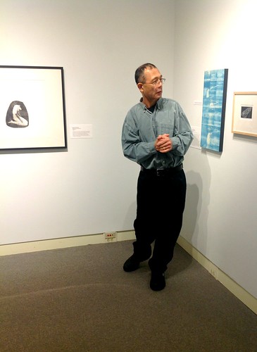
Currently on display at Dordt College in Sioux Center Iowa is a photo essay by New York based photographer and Dutch photo journalist René Clement. The show, which comprises 26 images of the terribly destructive effects of hurricane Sandy is on view in the Ribbens Academic Complex (Classroom Building).

Nov 12, 2012, Staten Island, New York—After hurricane Sandy. The top of a house drifted onto a neighbor's property. Images and text © 2012 René Clement — all rights reserved

A photo essay by René Clement titled “After Sandy” is on view in the main lobby of the Ribbens Academic Complex at Dordt College.
Saturday, December 29, 2012
“After Sandy” a photographic essay by René Clement is on display at Dordt College
Sunday, December 23, 2012
John Cage used press type to compose his mesostics

M: Writings ’67–‘72, 1973
Author: John Cage
Art director/designer: Raymond M. Grimaila, Middletown, Connecticut
Publisher: Wesleyan University Press
Interestingly, for the cover design Grimaila chose a type
style for the “M” that seems to be a precursor to Dala Floda.

This is an inside spread (p.122-23) from a chapter known as the Mushroom Book. Cage used press type to compose and produce his mesostics designs.
The Museum of Contemporary Art Chicago is hosting a marvelous ongoing exhibition series that features iconic works from the MCA Collection. Currently there’s a “Mixed Media” show titled, MCA DNA: John Cage, which started September 1 and runs to March 3, 2013. MCA online information explains the artifacts on display this way:
Materials demonstrating how to interpret the score of this important work [A Dip in the Lake: Ten Quicksteps, Sixty-two Waltzes, and Fifty-six Marches for Chicago and Vicinity (1978)], which later entered the MCA Collection, are on view along with scores and books drawn from the more than eighty items associated with Cage in the MCA Artists’ Books Collection.The exhibition at MCA honors the John Cage Centennial as well as Cage’s long-time relationship with the MCA. One of Cage’s pieces on display is one of his diary series, M: Writings ’67–‘72 that was published in 1973. The book features a collection of Cage’s mesostics that are, as someone described them, “inspired by music, mushrooms, Marcel Duchamp, Merce Cunningham, Marshall McCluhan, etc. and includes ‘Mureau’ composed from the writings of Henry David Thoreau.”
This publication was recognized in AIGA’s Fifty Books of the Year (1974) and is in the AIGA design archives. The Design Archives description states: “This is a miscellany written and printed pretty much according to the I Ching. It seems abstruse, but attuned readers can enjoy Cage’s high humor while soaking in the penetrating insights and anecdotes intended to ‘unstructured bourgeois’.”
Bibliography:Read More......
Cage, John. M: Writings, ’67-’72. n.p.: Wesleyan University Press, 1973. eBook Collection (EBSCOhost). Web. 21 Dec. 2012.
Tuesday, December 18, 2012
Juror Yuji Hiratsuka | The Printed Image 4 competition at the Alice C. Sabatini Gallery in Topeka
The Printed Image 4 exhibition juror Yuji Hiratsuka conducts a gallery talk for the Nelson-Atkins Museum Print Society. The biennial show runs from November 16 through December 30, 2012. Photograph credit: Betsy Roe for the Topeka & Shawnee County Public Library.

David Versluis
Spirit Lake Iowa Fish I
Wood engraving, 3" x 5"
Image © David Versluis
It seems Kansans are known as dedicated advocates for the democratic value of public libraries. Additionally, Kansas was the birthplace of the remarkable Prairie Print Makers Society, which was a consortium of very fine printmakers founded in 1930 and lasting into the 60s. Also, Topeka, Kansas is the hometown of Bradbury Thompson (1911–1995) who was one of the great graphic designers of the twentieth century.
So I was pleased to have a piece selected for The Printed Image 4 competition at the Alice C. Sabatini Gallery of the Topeka & Shawnee County Public Library
in Topeka. While I have not been to Topeka, the photos on flickr indicate a beautiful art gallery venue within an impressive public library. The Printed Image 4 is a national, juried printmaking exhibition.
In the photograph above, juror Yuji Hiratsuka of Oregon State University is standing near my wood engraving called Spirit Lake Iowa Fish I, which is also illustrated above. Actually, in the photograph, Yuji is discussing with the Nelson-Atkins Museum Print Society the technique of color woodcut in “Blue Kaw” a print by Lisa Grossman, of Lawrence, Kansas. Apparently the Kansas River is more commonly known as the “Kaw”. The gallery director chose to install my fish print next to “Blue Kaw” and as a result my print made it into this photograph. I appreciated seeing the photos since I was not able to attend.
Saturday, December 15, 2012
Minimalism, Measurement, and Primary Structures: Sol LeWitt, Stanley Tigerman, and Elaine Lustig Cohen


Sol LeWitt (American, 1928–2007)
Modular Cube/Base, 1967 (two views), photographs by versluis
Painted wood
Collection Museum of Contemporary Art Chicago, restricted gift of MCA Collectors Group, Men’s Council, and Women’s Board; Young/Hoffman Gallery; and National Endowment for the Arts Purchase Grant, 1978.60.1-2
Sol LeWitt was one of the important artists who participated in the 1966 Primary Structures exhibition that featured artwork associated with Minimalism. LeWitt’s piece, illustrated above, is representative of his work from 1967. This particular sculpture was displayed earlier this year in a post World War II anthology exhibition at the Museum of Contemporary Art Chicago. The exhibition featured artifacts from the MCA collection; the curatorial documentation mentions that:
In LeWitt’s sculptures such as this, cubes of fixed dimension (made even more clear by the gridded base) combine to create a much larger form. The relation between part and whole can be seen as a metaphor for all systems, whether natural or man-made, visible or subatomic, lending such exercises a truly humanistic overtone.

Elaine Lustig Cohen (b. 1927), catalog for The Jewish Museum (front and back covers)
Primary Structures: Younger American & British Sculptors, 1966
image is from Display.
Regarding the Primary Structures exhibition the MCA Chicago documentation states:
Building Blocks
One of the earliest exhibitions surveying the art movement that came to be known as Minimalism was titled Primary Structures. Presented at the Jewish Museum in New York in 1966, the exhibition and its theme still offer a useful way to think about some of the central concerns of artists working at that time. As the title suggests, the artists stripped their sculpture of unnecessary embellishment, focusing on the core components that shape two- and three-dimensional form. This approach directs us to focus on how an object is assembled, how its parts relate to one another, and the powerful effect color can have on perception and meaning, foregrounding the importance of the subtleties of surface, hue, texture, proportion, and relationships among these components. …

Stanley Tigerman (b. 1930), Formica Showroom, Grid Axonometric, 1986.
A wonderful correlation and contrast exists between LeWitt’s Modular Cube/Base and Tigerman’s drawing for the Formica Showroom project shown above. In the Cesi n‘est pas une rêverie: The Architecture of Stanley Tigerman exhibition catalog Emmanuel Petit writes:
Tigerman considers measurement to be an essential principle of legibility in architecture, and he sees the grid as the most potent architectural tool to structure space and time in a project. Unlike Mies, with his unequivocal grids, Tigerman avails himself of multiple grid systems that dislocate the sense of stability, orientation, and hierarchy, to suggest the existence of another non-linear order in architecture. (1)
- Petit, Emmanuel. "Nine Clouds of Architecture." Cesi n‘est pas une rêverie: The Architecture of Stanley Tigerman. Ed. Nina Rappaport. New Haven: Yale School of Architecture, 2011. n. pag. Print.
Wednesday, December 12, 2012
Stanley Tigerman: “Paintings & Multiples”

Stanley Tigerman
Paintings & Multiples, “A Meed of Fealty for Moire’s Tensile Strength,”
1965
Liqitex on mounted canvas
22" x 22"
Image ©Stanley Tigerman
Emmanuel Petit, in his essay “Nine Clouds of Architecture” writes that this painting is from “a series of oil and acrylic paintings from the mid-1960s [which] drew inspiration from Josef Albers, with whom Tigerman studied when he was at Yale; these are Tigerman's 'op art' experiments created through the medium of geometry.” (1)
Tigerman is a very fine draughtsman and his striking Op art image of the 60s, when rotated 90° and reduced, foreshadow the way he effectively represents water in architectural drawings like the one shown below.

Kingdom of Atlantis, axonometric, ink on vellum, 36 x 24.25", 1976-82
Image ©Stanley Tigerman
In addition, Tigerman‘s Op art paintings highlight his interest in visual ambiguity/uncertainty, which comprise figure and ground relationships. Perhaps these experiments in Op art portend his shift, by the 70s, from Modernism’s rational doctrines to postmodern unpredictability. Again, as Petit insightfully writes:
Tigerman first came to prominence at a time when late-Modernism tended to regurgitate the abstract forms of Modern architecture without much ideological persuasion. By the 1970s, Tigerman had set adrift the positivist certainties of architectural modernism, to which he had been exposed in his formative years. In particular, he confronted the rigidity of the Miesian grid with a more loosely defined curvilinear geometry. (2)
- Petit, Emmanuel. "Nine Clouds of Architecture." Cesi n‘est pas une rêverie: The Architecture of Stanley Tigerman. Ed. Nina Rappaport. New Haven: Yale School of Architecture, 2011. n. pag. Print.
- Ibid.
Sunday, December 9, 2012
The 2012 Dordt/Northwestern Student Art Show Poster

Jordan Edens, designer (Dordt class of 2013)
2012 Dordt College and Northwestern College Student Art Show Poster
Poster design: ©Jordan Edens
The following information is from the Dordt College news release:
The annual Dordt/Northwestern Student Art Exhibit is an occasion for students from both schools to share their best artwork of the year in a combined exhibit. This exhibition, which is juried by three students from each college, will run in the Dordt College Campus Center Art Gallery December 6 to January 10.“Artwork in the show seems to have a relational attitude with interests in formalistic explorations,” stated David Versluis, a Dordt College art professor. Read More......
At the opening reception last Thursday evening student jurors discussed their selections and the gathering was an opportunity to compare works from both institutions in a dialogue and exchange about what constitutes “good art.”
This joint exhibit by Dordt College and Northwestern College art students has been an annual tradition since 1999. The colleges alternate hosting the exhibit, with Dordt students selecting the Northwestern art that will be shown and Northwestern students selecting the Dordt art that will be shown.
Saturday, December 1, 2012
“to dazzle and confuse the eye”

Stanley Tigerman
Paintings & Multiples
Red Concavities, 1966
Oil on wood, 31" x 31"
Image ©Stanley Tigerman
This is one of Stanley Tigerman’s compelling Op Art experiments from the mid-60s.
There’s a great relationship between Op Art of the 1960s and the dazzle-ships and camouflage of World War I. Tigerman’s delightful tessellation illustrates nicely a description by Robert G. Skerret who spoke about ship dazzle camouflage in 1919. In a very useful anthology titled Ship Shape, edited by Roy R. Behrens, Skerret writes:
Various patterns, arranged according to their effectiveness, suitable for outline blurring after they have blended visibility into a uniform gray. When the patterns are discernible, however, they serve to dazzle and confuse the eye. (1)
- Skerret, Robert G. “hoodwinking the periscope.” Ship Shape: A Dazzle Camouflage Sourcebook. Ed. Roy R. Behrens. First ed. Dysart, Iowa: Bobolink Books, 2012. 123-26. Print.
Thursday, November 29, 2012
Stanley Tigerman : Yaleiana

Stanley Tigerman
Paintings & Multiples:
“I Pledge Allegiance to the Lozenge and to the Implications for Which it Stands, No. 8,”
1964
Liquitex on mounted canvas, 36" x 36"
Image ©Stanley Tigerman
Lozenge refers to a rhombus with acute angles of 45° to form a diamond. This piece is included in:
A series of oil and acrylic paintings from the mid-1960s [which] drew from Josef Albers, who had taught at Yale during the period 1950–58; these are Tigerman's Op Art experiments with the paradoxical effects created through the medium of geometry.
—information taken from the exhibition, Cesi n‘est pas une rêverie: The Architecture of Stanley Tigerman.Read More......
Monday, November 26, 2012
Study for Homage to the Square: Pale Autumn, 1963

The following information is taken from the MCA Chicago didactic:
Josef Albers (American, b. Germany, 1888–1976)
Study for Homage to the Square: Pale Autumn, 1963
Oil on board. Collection Museum of Contemporary Art Chicago, Gift of Mr. Edward Weiss, 1974.13
Albers was an influential teacher as well as artist, bringing ideas from the famous Bauhaus art school in Germany to the United States when he emigrated here in 1933. His theories on the perceptual effects of color were particularly important, and in works such as this he shows how a sense of spatial depth can be created through subtle changes within a single color range.Read More......
Tuesday, November 20, 2012
“The Formal Generators of Structure”

Stanley Tigerman
The Formal Generators of Structure
1965-68
Oil on panel
34 inches x 34 inches
images: ©Stanley Tigerman
Image from the Graham Foundation’s exhibition of Stanley Tigerman, Cesi n‘est pas une rêverie:
Architectonic extensions of my Albers-motivated paintings and sculptures, these forms work out in three dimensions basic, orthogonally historical archetypes. After three years of moving toward bifocal vision, I felt it time to stop before the world of polyhedra took over. —Stanley TigermanRead More......
Thursday, November 15, 2012
“with a grid, but with no memory”

Chicago Architectural Foundation: “Models of visionary plans from the past float over the Chicago Model.”
Instant City
Stanley Tigerman
1966
Dwight D. Eisenhower Expressway
An inscription from Tigerman’s retrospective exhibition at The Graham Foundation earlier this year stated:
Stanley Tigerman’s native Chicago has been a vital component of his self-identity. As a city “with a grid, but with no memory,” Chicago is truly the progeny not only of its pragmatist culture but also of the architectural hegemony of Mies van der Rohe. …The image above is from an exhibition at the Chicago Architectural Foundation. Documentation for this model explains:
Stanley Tigerman rethought the urban tower with Instant City, a proposal that makes use of underutilized space above an expressway. While infrastructure often challenges the continuity of the urban design, Instant City takes advantage of the highway by leaping over it. Each tower consists of two slim legs that lean against one another. Visitors travel on diagonal elevators through the lower commercial floors into the upper stories, which contain apartments.
This project shows how megastructures can reconnect cities divided by transportation networks.
Model courtesy DSM’s Somos® Materials group.Read More......
Sunday, November 11, 2012
Envelope art by Carl Regehr, 1983


Above is an example of one of Carl Regehr’s delightful envelopes and Polaroids (Jazz is shown) that were on display at the STA 85th anniversary celebration in Chicago last month. The show celebrated and featured numerous pieces of imaginative envelope art and Polaroids by Regehr. A remarkable thing about Carl was that he could pre-visualize and sketch out his design concepts with great coherency.
The envelopes and Polaroids were from correspondence between Regehr and Victor Margolin in 1983. Margolin was instrumental in developing the discipline of design history at University of Illinois Chicago and Regehr was a beloved design professor at the University in Campaign-Urbana. The envelope illustrated above is postmarked 12 Jan 1983. Regehr died in 1983 after a decade-long battle with cancer.
Also shown above is the accompanying written note and documentation for the Carl Regehr/Victor Margolin project and the exhibit.
True to Carl's idea for the envelope display, event organizer Jack Wiess installed the show with envelopes and corresponding Polaroid typographic collages in plastic bags that hung on a “clothes-line”.
In his hand-writing Regehr suggests to Margolin:
For example I could see that at the end of the year there might be 100's of envelopes that could be exhibited in plastic baggies … etc. The project also is valuable because it attempts to share interests and continue the dialogue we established last year.
signed Carlos. (Carl’s Latino persona)Read More......
Tuesday, November 6, 2012
“The Prisoner”


To reform the Three Strikes Law in California, artist John August Swanson featured an image from his 1975 screen print tryptych titled “The Prisoner” for a postcard. The postcard is to help generate awareness and support for California Proposition 36, which is on the November 6th ballot. Proposition 36 would stop keeping non-violent people in prison for life and ensure justice and fair sentencing.
Voting yes would revise the three strikes law to impose life sentence only when the new felony conviction is serious, or violent, and authorizes re-sentencing for offenders currently serving life sentences.
“The Prisoner” is one of several early Swanson serigraphs that are currently on display at Dordt College in Sioux Center, Iowa. The collection is on loan from Luther Seminary in St. Paul, Minnesota.
Sunday, November 4, 2012
Chicago design luminaries

The newest STA (Society of Typographic Arts) publication, “Carl Regehr: The Lost Journals” (1968–1983) was recently introduced at the STA 85th anniversary celebration. I had the opportunity to attend the recent STA 85th anniversary celebration in Chicago on Friday, October 26 and was thrilled to have several Chicago design luminaries autograph my copy of the book. Above is photograph of the title page spread with the signatures of Jack Weiss, Susan Jackson Keig, Robert Vogele, and Norman Perman.
Interestingly, Susan Jackson Keig, who had been one of Moholy-Nagy’s first students at the New Bauhaus in Chicago during the late 30s and early 40s, said that Moholy also taught business courses because money was so tight for the design school.
In this blog I’ve published a couple of pieces about Carl Regehr (1919-1983) who was one of Chicago’s best designers and educators, an Honorary Member of The STA, recepient of its Design Educator Award in 1983 the excellent designer and design educator. The STA organization of mainly graphic design professionals was brought back about a decade ago. From its inception the STA has had a robust series of events, hosted visiting designers and produced several noteworthy publications.
Wednesday, October 31, 2012
David Behrman and Okkyung Lee: collaborative improvisations performed at the Graham Foundation, Chicago

Pictured is “back to the future” David Behrman (b. 1937, Salzburg, Austria) adjusting his set up before performing his “View Finder” (guitar and electronics) and “Freeze Dip” (violin and electronics). The concert took place last Saturday night, October 27 at the Graham Foundation in Chicago.
This exceptional musical performance was part of the Lampo performance series. It was an excellent opportunity and rare privilege to listen and see the collaborative improvisations performed by David Behrman and Okkyung Lee. Collectively the performance pieces were strangely beautiful by conveying a sense of ambiguity and mystery. Perhaps the music is best described the way Mikhail Baryshnikov described Merce Cunningham’s dance performances—as “a kind of organized chaos.”
Lampo’s promotional copy for the event mentions:
The music, which cellist Okkyung Lee premiered with the TILT brass ensemble, mixes and alternates the sounds of one or several acoustic instruments with computer-enhanced and computer-generated ones, in an unfolding sequence of situations, some very free, some lightly-notated.
David Behrman has been active as a composer and artist since the 1960s and has created many works for performance as well as sound installations. Most of his music has involved homemade electronics and computer-controlled music systems that operate interactively with collaborating performers.
In 1966 he founded the Sonic Arts Union with Robert Ashley, Alvin Lucier and Gordon Mumma. Working at Columbia Records in the late 60s, he produced the “ usic of Our Time” series of new music recordings, which presented works by Cage, Oliveros, Lucier, Reich, Riley, Pousseur and other influential composers. He has had a long association with the Merce Cunningham Dance Company as composer and performer and has created music for several of the Company's repertory pieces.
Both musicians live in New York. The concert was presented in partnership with the Graham Foundation; organized in cooperation with the School of the Art Institute of Chicago, Department of Sound.Read More......
Sunday, October 21, 2012
California Proposition 34


Pictured are two posters from a series of four produced by artist, activist, and peacemaker John August Swanson in support of California’s Proposition 34, abolishing the death penalty in that state.
Each poster represents depictions of the Crucifixion of Jesus, with a message of transformation and hope.
Capital punishment is an issue that provokes strong opinions on both sides of the issue — empathizing with the grieving families of victims on the one hand while seeing the need for the fair treatment of those on death row and questioning the taking of another life, on the other.
Here in the Midwest I’m proud to say the state of Iowa does not have the death penalty. Several years ago (and to his credit) the former governor of Illinois, George Ryan instituted a moratorium on the death penalty after his administration became aware of how horribly flawed the justice system was for death row inmates.
We are all imperfect and our systems are blemished too. Jesus did say that the first person who is absolutely perfect can throw the first stone. John 7:53-8:11 NIV
Sunday, October 14, 2012
John A. Swanson’s “Let Us Now Praise Famous Men,” c.1970 screen print collage


John August Swanson from Los Angeles was a guest artist at Dordt College on Wednesday and Thursday October 10–11. John spent time discussing his work with students and staff. In this photograph Swanson talks about one of his earliest works “Let Us Now Praise Famous Men” which is a screen printed collage from c.1970. This particular print on display is from the collection of Luther Seminary, St. Paul, Minnesota. By the way, John is wearing the “Fear Is The Opposite Of Faith” T-shirt from Sojourners.
It was a great privilege to have John on campus for a couple of days.
Much of Swanson’s body of work as well as his early prints are lyrical expressions advocating fairness, justice, and equality. As John states:
When I was starting my work as an artist from 1968 to 1975, I was influenced by political ideas and movements, and the songs and speeches of the 1960s and 70s. I created a series of works similar to newspapers—collages of lettering, artwork, and photos, an “exploding newspaper.
Using my knowledge of photography, and working in darkrooms, I overexposed photographs to simplify them, and create stark solarized images, which I felt complimented the lettering [that I drew by hand or carved from rubber erasers]. I combined the lettering, photos and rubberstamp images with texts that were meaningful to me: the words of the writer, James Agee; the poet, Lawrence Ferlinghetti; and the labor leader, Cèsar Chávez; as well as song lyrics.The title of the print comes from classic literature, Let Us Now Praise Famous Men. The publication was a collaboration between writer James Agee and photographer Walker Evans. The book chronicles the lives of three sharecropper tenant families in Alabama in 1936, during the Great Depression.
For Swanson’s poster it’s very striking how he mixes and assembles typographic styles and images and portrays the book title followed by the passage, which is reproduced below in boldface. Agee, writing on a summer night, prefaced the words found in the poster saying:
A man and a woman are drawn together upon a bed and there is a child and there are children: …
Moreover, these flexions are taking place every where, like a simultaneous motion of all the waves of the water of the world: and these are the classic patterns, and this is the weaving, of human living: of whose fabric each individual is a part: and of all parts of this fabric let this be borne in mind:
Each is intimately connected with the bottom and extremest reach of time: Each is composed of substances identical with the substance of all that surrounds him, both the common objects of his disregard, and the hot centers of stars:
All that each person is, and experiences, and shall never experience, in body and in mind, all these things are differing expressions of himself and of one root, and are identical: and not one of these things nor one of these persons is ever quite to be duplicated, nor replaced, nor has it ever quite had precedent: but each is a new and incommunicably tender life, wounded in every breath, and almost as hardly killed as easily wounded: sustaining, for a while, without defense, the enormous assaults of the universe:
So that how it can be that a stone, a plant, a star, can take on the burden of being; and how it is that a child can take on the burden of breathing; and how through so long a continuation and cumulation of the burden of each moment one on another, does any creature bear to exist, and not break utterly to fragments of nothing: these are matters too dreadful and fortitudes too gigantic to meditate long and not forever to worship. (1)
- Agee, James, and Walker Evans. Let Us Now Praise Famous Men. New York: Ballantine Books, 1960 / Fourth Printing 1972. 53-54. Print.
Wednesday, October 3, 2012
On display at Dordt College, John August Swanson’s art brings stories to life

SIOUX CENTER, IA – The Dordt College Department of Art and Design presents the Richard and Helen DeVos Collection of The Art of John August Swanson, an exhibit of original, hand-pulled serigraphs by Los Angles based master printmaker John Swanson. The collection will be on display in the Dordt College Campus Center Art Gallery from October 10 to December 1.
A master printmaker of serigraphs, lithographs, and etchings, Swanson’s art is about “bringing stories to life.” His creative vision reflects the gift of storytelling he inherited from his Mexican mother and Swedish father. Influenced by the imagery of Persian and medieval miniatures, the tradition of Orthodox iconography, Swedish and Latin American folk art, as well as Diego Rivera and the Mexican muralists, Swanson’s beautiful narrative art explores human values, cultural and religious roots, and his ongoing quest for self-discovery through the visual.
Using up to 89 color stencils to print one serigraph, John expertly utilizes his medium to create rich, images that are filled with great beauty, mystery, and meaning. The serigraphs are unique examples of how art can visually preach the Word and offer creative insight into biblical stories and their meanings. His art brings these familiar stories to life in new and inspiring ways as visual parables of our everyday lives.
Swanson draws viewers into stories that show how everyday lives are filled with God’s love and presence. His work shows that the sacred permeates the ordinary.
In addition, some of Swanson’s earliest screen prints and posters will be on display in the Ribbens Academic Complex lobby and hallway near the Dordt College art department. These early pieces show the strong influence of Corita Kent, a mentor of Swanson’s who is highly respected for her colorful calligraphy and silk screens.
The public is also invited to attend the opening of the DeVos Collection Exhibition and Gallery Tour hosted by John Swanson on Wednesday, October 10, at 7:30 p.m.
On Thursday, October 11, from 4 to 5 p.m. Janaan Manternach of Dubuque Iowa will present “The Art and Vision of John August Swanson.” Manternach is a collector of Swanson’s work and, with her deceased husband Carl J. Pfeifer, founded Life, Love, Joy, Associates and has written numerous religious education textbooks, columns, articles, and books.
Then again on Thursday evening, from 7:30 to 8:30 p.m., Swanson will present “Seeing the Sacred in the Ordinary.” Both events will be held in SB101.
Sunday, September 30, 2012
“The Artist’s Studio” by Franklin McMahon

The Artist’s Studio by Franklin McMahon (1921-2012), ink on paper.
Illustration is taken from American Artist magazine, “Drawn Directly with Brush and Ink,” April 1956. 54.
Franklin McMahon’s artwork relies on a strong lyrical and personal story for impact, which makes his illustrations fine art. His direct drawing approach and spontaneous contour lines develop work that seems to breathe—one can almost feel McMahon’s compositions inhale and exhale. McMahon, who died this year (March 3, 2012) was an internationally known artist-reporter and illustrator from Lake Forest, Illinois.
By accentuating straight lines and angles McMahon’s illustrations are more than objective renderings. His unique and idiosyncratic style seems like a synthesis of hand-drawing with lens distortion without using the camera.
Saturday, September 22, 2012
John August Swanson: POWER TO THE PEOPLE POSTER

Los Angeles based artist John August Swanson captures the look and feel of art in the streets. Poster, 24" x 36"— © John August Swanson 2008. Images and copy taken from John August Swanson’s website.
It is my hope that this art work might serve as an inspiration and a tool for those working to organize those who have been displaced & marginalized by economic injustice into compassionate communities empowered to implement justice and bring peace. —John August Swanson

At the left side of my serigraph, there is an employment agency with a long line of people waiting to sign on a waiting list. Our “Unemployed Man” is seen at the moment he writes down his name. He continues into the next panel, where he walks down the street, feeling alone and powerless, as he passes factories and office buildings with “No Jobs” signs posted.

He is standing outside an overcrowded hotel where he has just picked up a newspaper which announces a march, a gathering of many people, of many communities coming together to address their common problems.

He is the foreground figure in a huge gathering of people who have come together to call for quality universal healthcare, better schools, affordable housing, living wages, equal pay and job training. Many of their signs promote strength in unity, community organizing, and peace. This large group of people is positioned so that they march toward the viewer as if they are moving forward out of the picture.
Read More......
Friday, September 14, 2012
John August Swanson as graphic designer: 1972 Cesar Chavez United Farm Workers Poster

John August Swanson, Struggle for Justice: 40th Anniversary Poster, 2012/1972
© John August Swanson 2012
“It is my hope that this art work [my posters] might serve as an inspiration and a tool for those working to organize those who have been displaced and marginalized by economic injustice into compassionate communities empowered to implement justice and bring peace.” —John August Swanson
The Dordt College department of art and design is busy preparing and anticipating the next art exhibition featuring the Richard and Helen De Vos collection of John August Swanson's iconic advent series of serigraphs. The exhibition will be installed in the Campus Center Art Gallery from October 10 to December 2.
In addition, we have become inspired by Swanson graphic design work. Compared to Swanson's serigraphs very little is known about his social activist posters. Illustrated above is John's recently reissued poster from 1972 titled "Struggle for Justice” which is a 40th anniversary commemorative piece. Of import is that the poster has as much relevance today as it did in 1968 and the poster is a significant reminder that challenges still exist for racial and economic justice in our society.
About the poster Swanson writes the following on his website:
The poster, STRUGGLE FOR JUSTICE, was first created forty years ago, in 1972 to help raise money for the United Farm Workers. The original printing was limited to one hundred posters.
As I recall, the union provided me with a statement from Cesar Chavez’s 1968 speech. My idea for the poster design was to use his words to create a “newspaper,” a black and white montage of photos and lettering. For the lettering, I used a variety of typefaces; many of these were rubber-stamp alphabets I had carved from rubber erasers and other materials. His words became my “headlines,” accompanied by images showing the struggles of the United Farm Workers in our agricultural fields and the attacks from the giant agribusiness corporations. I also used other photos depicting labor, race, and economic struggles throughout the 20th century in the United States. I interspersed the words and photo images, hoping that this would be an interesting design and would best communicate the message of our continuing struggle to bring justice for all.Read More......
In 2011, I felt the message still resonated with strong grass-root movements: the energetic actions of the Occupy Movement, the growing awareness and participation of the Global Warming and Environmental Movements, the struggle of workers to protect their labor unions, and the renewed effort of the Peace Movement. I decided the poster should be reprinted. The original poster was revised with new images, revised spacing, and adapted text. Now, I hope this poster will bring Chávez’s powerful words to students, to union workers, and to those who struggle for justice. I hope this work will encourage, strengthen, and empower those who seek a just and peaceful world.
Monday, September 10, 2012
Behrens and Versluis collaborative print selected for the Washington Pavilion Visual Arts Center’s First Juried Exhibition

David M. Versluis and Roy R. Behrens, Iowa Insect Series: Yellow Jacket,
digital collage–giclee print, 2012. Image copyright © David M. Versluis/Roy R. Behrens
A collaborative print by David Versluis, Sioux Center, Iowa and Roy Behrens, Dysart, Iowa was selected for the Washington Pavilion Visual Arts Center’s first national juried exhibition in Sioux Falls, South Dakota. Art professor Behrens teaches graphic design at the University of Northern Iowa and Versluis teaches graphic design at Dordt College. The piece selected for recognition is from the “Iowa Insect Series” of 10 images, which were completed during the month of January, 2012. The collaboration was long distance and image files were volleyed back and forth while each artist added, subtracted or modified the image until both felt the print was finished and the series was completed.
The First Juried Exhibition runs from September 14 through December 2, 2012 in the Everist Gallery; the Opening Reception is September 15 from 5:30 to 7:30 p.m.
Some notes from the Juror, Megan Johnston:
The task of selecting only 60 works from amongst the 508 entered was very difficult. Many strong works were not selected in order to have a clearer curatorial intention, which will hopefully be evident in the show. In order to create an exhibition that had a voice or a story to tell, works were selected based on several curatorial themes that emerged from amongst the pool of submissions and not necessarily on individual pieces. Newer work was selected over older work in general.
Some of the curatorial thrusts that emerged from the pool of works during the selection process: an investigation of materials; politics; landscape; nature; and death. There is a strong visual leaning towards the natural world—themes and ideas, materials and construction, imagery and subject matter. The selection process went beyond the identification of works that were simply (even though highly) beautiful to look at or were well-executed and sought out works that contained multiple layers of narrative, were examples of interesting or non-traditional use of materials (or re-use of traditional materials) and/or had something to say in relation to sociopolitical, economic, or historical nuances.Megan Johnston is the director of curatorial affairs and interpretation for the Plains Art Museum, Fargo, North Dakota. Read More......
Thursday, September 6, 2012
“Look for deeper meanings in life and in art”: a report on artist Steve A. Prince’s visit to Dordt College, September 1-4, 2012

From a photo shoot of Steve A. Prince’s art exhibition at Dordt College. This photograph illustrates Steve standing next to Exodus: Bread from Heaven which is from the Old Testament series, 2012, 24 in. x 36 in., Linoleum Cut. Photos by Doug Burg.

Steve poses next to Job: Take me to the Water, also from the Old Testament series, Linoleum Cut. To the left is
Lamentations: Send your Rain, 2012, Linoleum Cut.
Student recollections (in their words) of quotes from Steve’s presentations:
- Be a Living Epistle
- Keep the light on!
- Be the Ecclesia — “the called out ones”
- MINE your business; dig deeper than the surface
- Confront life’s nastiness
- There are gaping wounds that need to be healed
- Old soil [the past] is doomed to be repeated unless addressed
- Your past may be stained but your future is untouched
Last Tuesday (9.4.12) Steve wrapped up his time at Dordt College as the First Mondays Speaker, visiting gallery artist, studio guest, and workshop leader. Steve has developed a reputation as an excellent and demanding teacher; he's continually producing artwork and commissions that have received international acclaim while managing a full schedule of gallery exhibitions, workshops, and lectures to audiences of all ages.
On Labor Day Steve spoke in the morning to a full house in the BJ Haan Auditorium and had his audience riveted. The afternoon was dedicated to a monoprint workshop with 18 participants. In the evening event Steve’s presentation was both powerful and profound. He went into more detail and deepened the themes of his morning lecture by showing a more complete body of his artwork. Steve is one of the finest storytellers I’ve ever heard and of great interest to me is the way in which he tells his narratives through visual art. Steve’s evening presentation was titled, “Second Line: The Art of Social Justice.” He began by showing a slide of one of his pieces in the Dordt exhibition titled, “Requiem for Brother John” and described the work which is based on the New Orleans funeral tradition of the dirge as a sad song for the one who has passed away. In Steve’s art the dirge is a metaphor for personal and communal sadness, corruption, and loss – the sad fact that things are not right in the world.
Then as a sure sign of hopefulness Steve followed his “Requiem” piece with the next piece called, “Second Line: Rebirth” in which he described the contrast as “cathartic”. In the New Orleans funeral tradition, after the mourning has taken place, the processional continues as a “Second Line” and becomes a celebration of the life of the one who has passed away. In the afterlife the person's life is made new and he/she is reborn. In Steve’s artwork, the “Second Line” is a metaphor for purification, liberation, and cleansing.
In several ways the themes of the “Dirge” and the “Second Line” are foundational metaphors in most of Steve’s work. His work is intense and challenging, symbolized by very strong black and white contrasts; every aspect of the compositions is full of meaning.
Steve has had a very positive impact on each community that he's been a part of and on those who view his work, as well. His artwork conveys the impact of the New Orleans storytelling tradition. Steve speaks sincerely from his heart and is genuinely interested in making the world a better place to live. Steve's abilities and talents are amazing and we were very fortunate to have him on campus.
Steve Prince’s visit to Dordt College was sponsored by the Andreas Center for Reformed Scholarship and Service. Read More......
Wednesday, August 29, 2012
“Spirit Lake Iowa Fish I” wood engraving selected for the national “Printed Image IV” biennial exhibition

David Versluis, Spirit Lake Iowa Fish I, Wood engraving, 3 inches x 5 inches, 2009-10
Printed on a Vandercook Proof Press. Image © David Versluis, 2012
We’re please to announce that a wood engraving by David Versluis was selected for recognition in the national juried exhibition, Printed Image IV. The small engraving took Versluis about 25 hours to complete. The exhibition will be hosted at the Alice C. Sabatini Gallery at the Topeka and Shawnee County Public Library, Topeka, Kansas, from November 16–December 28, 2012. In previous years this exhibition has been held at other venues such as Washburn University, Topeka.
This original print which is a piece from the Spirit Lake, Iowa Fish Series, responds allusively and metaphorically to the primordial fish as a unique creature symbolizing creational care. In addition, this image becomes a simile of Gyotaku, the Japanese art of fish-printing.
The Printed Image is a national, juried printmaking competition, which features new and experimental work from artists around the country and supports artists working in hand-pulled print media. The exhibition is an opportunity to view the latest trends in printmaking.
This year’s juror is Yuji Hiratsuka who currently is on the art/printmaking faculty at Oregon State University. Hiratsuka received his B.S. in Art Education from Tokyo Gakugei University, his M.A. in Printmaking from New Mexico State University, and his M.F.A. in Printmaking from Indiana University.
Tuesday, August 21, 2012
Steve Prince’s “One Fish: Old Testament” art exhibit on display at Dordt College

Psalm I: Slow Dance, Linoleum cut, 18 inches x 24 inches, from the Old Testament Series
Image courtesy of Eyekons Gallery © Steve A. Prince
Information from Dordt's news release:
For Steve Prince, art is a tool used to battle social issues like violence, racism, and injustice. His art is “a conduit of God’s grace, helping people make sense of their lives and realize that their actions have consequences,” said Prince. “There are a lot of things we haven’t dealt with in our souls, so I like to deal with them in my artwork.” The result is art that is interwoven with social metaphors and symbolic messages.
Prince has brought “One Fish: Old Testament” to Dordt College. The exhibit is housed in the college’s Campus Center Art Gallery and in the Ribbens Academic Complex art galleries through October 2, and features recent artwork including drawings and linocuts. The public is invited to enjoy the exhibit free of charge daily from 7 a.m. to 10 p.m.
Indicative of Prince’s work, the exhibit is filled with images that show his incredible imagination and drawing abilities. “Old Testament” is a “love series” that is metaphorically inspired by the Bible, says Dordt College art professor and gallery coordinator David Versluis. In much of his work, Prince visually interprets the biblical narrative and gives it a fresh context in a contemporary and urban framework.
Founder of One Fish Studio based in Silver Spring, Maryland, Prince is an artist, educator, and art evangelist. Having grown up in New Orleans, Prince allows the city’s rich traditions in art, music, and religion to pulsate through his work. He says, “The concept of One Fish Studio is derived from Matthew 4:19, when Christ said, ‘follow me, and I will make you fishers of men.’”
Prince’s faith calls him to be an artist; his work is an unending exploration of that faith and its relationship to his life, his culture, and his community. “We are all living epistles, whether we want to be or not,” said Prince. He will expound on some of these themes when he comes to campus on Sunday and Monday, September 2 and 3.
An exhibit reception will be held on Sunday from 7 to 8:30 p.m. with an artist talk at 8. He will also speak Monday at 11 a.m. in the B.J. Haan Auditorium as the first in a series of First Mondays Speakers.
The public is also welcome to participate in a Watercolor Callagraphy Workshop on Monday from 1:30 to 4:30 p.m.
Saturday, August 18, 2012
The Foshay Tower nameplate in Minneapolis

This is the bronze nameplate from the Foshay Tower in Minneapolis, Minnesota which is on display in the building’s museum and observation deck (on the 30th floor). The architectural style and details of the building’s exterior and interior feature primarily elements of Art Deco and Moderne elements. The lettering of the nameplate, meanwhile suggests the curvilinear elasticity and type style of Victorian typographic and lithographic printing merging with Art Nouveau—characteristics of the late nineteenth and early twentieth centuries. It’s interesting that the nameplate typography signals qualities of the future while alluding to typographic forms of the past.
The Foshay Tower was completed in 1929 by Wilber B. Foshay and was for many years the tallest skyscraper in Minneapolis. The building was designed by the Magney & Tusler, architects as a classical obelisk and homage to the Washington Monument in Washington D.C.
Wednesday, August 15, 2012
Marcel Breuer’s Saint Francis de Sales Church, Muskegon, Michigan


Elevation views and a couple of interior views of Saint Francis de Sales Church, Muskegon, Michigan, which was designed by Marcel Breuer and Associates and dedicated in 1966 (cornerstone states 1966). The building is positioned on an east/west axis and faces east in the traditional manner. Photographs by David Versluis © 2012
In the reference book, Design in the 20th Century, Charlotte & Peter Fiell explain, “He [Breuer] founded Marcel Breuer and Associates in New York in 1956, and around that time, like Le Corbusier, made concrete his material of choice. He used this medium in a highly sculptural and innovative way for his design of the monumental Whitney Museum of American Art, New York (1966).” [1]
Like the Whitney, the church in Muskegon is constructed with site-cast concrete in molds. In spite of a later addition the original impact of the church building is still very evident. One of the most striking features of this building is it’s mathematical, hyperbolic paraboloid form, which builds a structure constructed of entirely straight lines but the visual effect creates a curve. In other words, the back is opposite the front and the sides result in a curved surface. Other compelling features include the cantilevered belfry and the massive sculptured-relief cross beneath it.
As a side note:
Another example of Christian church architecture, by Breuer, is the St John’s Abbey Church located in Collegeville, Minnesota.
- Fiell, Charlotte, and Peter Fiell. “Marcel Breuer.” Design of the 20th Century. Ed. Susanne Husemann. 1999. 134-35. Print.
Sunday, August 5, 2012
Gilbert Lesser: a shout-out 1959 style

“P.T. Barnum-sized modern type designed by Gilbert Lesser (1935-1990).”[1]
A 1959 ad for Fortune Magazine.
This early work from 1959 by graphic designer Gilbert Lesser indicates the strong influence of mid-twentieth century Swiss Object Posters. The so-called “Object Posters” are usually characterized by a single over-sized object symbolic image combined with typography. Incitement by image was normally the objective.
Like the Swiss Modernists, Lesser uses a typographic grid implied by the truck trailer and bold sans serif fonts to make a statement. Added to this, the word “Survey” is divided according to its syllables for visual and aural emphasis yet helps maintain an orderly and unified structure. The combination of black and white photography with bold and stacked typographic elements signals a post-war marketplace entering the era of mass media.
- Ettenberg, Eugene M. “Graphic Arts: U.S.A.” American Artist June 1962: 111. Print.
