Tuesday, June 30, 2009

Respectfully (submitted)


Blur-RV – copyright © Rick Valicenti 28 June 2009

Preface
Yesterday (29th), just before lunchtime, we received an e-mail message from Rick Valicenti, Thirst 3st (click to see his BLUR viewbook) and I thought it fitting to post – thanks for Rick’s permission. Seeing Valicenti’s images made me think about the following:
  1. the shelf-life of pop-cultural paradigms.
  2. the lyrics to 'Face on the Cutting Room Floor' – a song co-written by Steve Goodman with Nitty Gritty Dirt Band members Jeff Hanna and Jimmy Ibbotson.
  3. what if David Hockney used Photoshop for his photographic collages and composite polaroids.
Ironically, the lives of Michael and Farrah seemed to be humanized through Ms. Fawcett’s battle with cancer and apparently, the fact, that Michael’s parents will raise his children.

Here’s the correspondence:
dear friend,

since friday it seems as if every pixel everywhere felt alive with the passing of farrah and michael...

after reading two personal accounts in today's New York Times, i too wanted to find a way to sit with michael and farrah, say goodbye, and pay my respects. i know it may look peculiar, but oddly enough, my attached version of cut and paste scrap booking has in many respects holds for me the BLUR surrounding their passing.

in the spirit of sharing time well spent, here's a glimpse of a couple of hours from my sunday afternoon at home in front of the monitor. yes, i too can see that the typography is a bit olde school, but it really doesn't matter in the scope of the important things in life.

ok, dinner time!
:)

r

Thanks Rick.

Amalgamated imagery.
As I was looking at your book, as if in a stream-of-consciousness, I thought of the Nitty Gritty Dirt Band song 'Face on The Cutting Room Floor.' However, it's also possible that I may have missed your intent.

She's history
No one would give her a star on the walk
She'd have a hundred if pillows could talk
Where have I seen her before?
She's the face on the cutting room floor

It's no mystery
Acting in school at the tenderest age
Lit up the room when she stepped on the stage
Came to la for some more
She's the face on the cutting room floor ...

sterkte,
dv

Read More......

Friday, June 26, 2009

Dordt Alumni in Design: Jon Dykstra


‘Lantern’ Cabin Design, South Sioux City Camp Ground; Iowa State University – Design Build Studio. The cabin is 12' x 14' (168 s.f.) with an additional 12' x 14' deck directly in front. Images copyrighted © 2009 Jonathon Dykstra.

A few weeks ago, Dordt alumnus Jonathan Dykstra, class of 2006, (graphic design emphasis/pre-architecture) e-mailed me his current portfolio along with a note. Immediately, from a graphic design perspective, I was excited to receive his well-crafted and thoughtful portfolio. Indeed, the scope and complexity of his architectural design work is very impressive. A particular project called the ‘Lantern’ Cabin, is an especially elegant design concept and had the distinction of actually being constructed – it’s pictured above. Jon was part of a design team responsible for the project and in a moment we’ll mention just a little more about it.

Also, Jon says, “Things are very good. I graduated this year from Iowa State University (ISU) with my M. Arch, which was really exciting however; I think I will miss school and Ames. Recently, I sent out my portfolio, to a whole bunch of firms all over the country and the response has always been positive. I'm not too interested in the mega-firms; something smaller would be a better learning environment.” And so, he recently took a job with Neumann MonsonWictor Architects, a firm in Sioux City, Iowa. (This is the firm that designed the Dordt College Campus Center and new Classroom Building Addition and Retrofit, which includes the new Department of Art and Design space).

As a side, one should know that upon graduation, an architecture candidate looks for a paid internship with a firm. After working ‘on- the-job’ for a certain length of time a person can take the State licensing exams, for certification, to be an architect.

The photographs for this post document the ‘Lantern’ Cabin Project, which was a 2008 spring semester project, initiated by the South Sioux City Department of Recreation with a budget of $20,000. For help, 'the Project’ enlisted a team of 15 students from Iowa State University and an additional $13,000 was donated by businesses. Students along with their instructor, Bruce Bassler, volunteered their services to design and build a cabin in a city-park campground along the Missouri River.

Jon states in his portfolio, “Involvement in this project was largely based on previous experience and as a result I took a lead role in a number of areas. The selection committee chose my design (group of three) to be built. Being the only member with concrete experience I led a team to design, construct, transport, and install the pre-cast concrete walls. I designed and engineered drawings, organized the groundwork, built and poured footings, recycled wood form liners, manufactured steel inserts, and did all scheduling. I was also heavily involved in the design of the zinc wall; in addition I was the main contact between the zinc, polygal, and lumber resellers.”

In April 2008, the project received public recognition highlighted with an article in the Sioux City Journal (click here). As a follow-up to that piece was another article – a major feature in the Sunday edition of the Sioux City Journal titled ‘Dream Project – Student Designers Look Ahead to Careers’ (click here).


‘Lantern’ Cabin Design: exterior and interior details which emphasizes the clerestory band of natural light and space. Images copyrighted © 2009 Jonathon Dykstra.

Read More......

Tuesday, June 23, 2009

What does compassionate graphic design look like?


Bobby C. Martin Jr. at Gel 2008 from Gel Conference on Vimeo(15 min.)

Culture? was the theme of the Christians in the Visual Arts (CIVA) 2009 Biennial Conference held last week at Bethel University in St. Paul, Minnesota and where I presented a paper titled, Creational Graphic Design. After the presentation, conference attendee, Kristin Myers Harvey told me about a great example of graphic design used in the service of positive cultural change and influence. This example was brought about through the auspices of the Abyssinian Baptist Church (ABC) of Harlem, New York and supported by a grant from the Sappi paper company. In 2003, as a graphic design student, Bobby C. Martin Jr. won a Sappi Grant for his M.F.A. thesis project, which was the compelling outdoor billboard campaign in Harlem called The Word on the Street. The Sappi, ideas that matter, website states: “ABC has a long tradition of community advocacy and empowerment. An important part of its mission is to create a viable, dynamic and positive society in the troubled neighborhoods of Central Harlem.”

Applications for the Sappi ideas that matter 2009, call for entry, are due in mid July. Do any of you have ideas for a proposal that we could submit as a Dordt College design student group? Please let us know.

Here’s an excerpt from the conference paper (I always encourage responses):

In the early 1980s, I became interested in Calvin Seerveld’s understanding of Christian culturing to support my art, design, and teaching philosophy. What I appreciate about Seerveld’s philosophical insights is that he leaves room for art and design to reflect back on itself. He allows the elements and media of art to be meaningful and celebratory. In this way, art and design do not have to serve only an aesthetic philosophy but one can benefit and delight in the artifact itself. Seerveld suggests that art is God’s gift to humans and can help us look at all facets of life—beautiful and ugly. Particularly helpful from a design standpoint is Seerveld’s assertion that “artistry is a subtle quality which permeates the whole object or event with an engaging metaphorical coagulation of nuances. An artwork is designed to be a loosely symbolific gift of oblique knowledge.” In addition, some of my views about graphic design, are based on Seerveld’s essay 'Modern Art and the Birth of Culture' as found in his book Rainbows for the Fallen World (1980). In the essay, Seerveld describes Christian culture as “the lordship of Jesus Christ as revealed in the Bible leads the way and marks the act or product with the holy spirit of compassionate judgment.”

Seerveld becomes more incisive when he gives these examples:
“We have got to realize more vividly that truly Christian conversation (= conversation marked by compassionate judgment honoring Jesus Christ’s Rule in its phrasings and very inflection) deepens interpersonal relationships with excitement and joy, while secularized talk brings coldness, numbness, and squalor (cf. Psalm 1, Proverbs 15:1-4). Christian journalism (= reportage in word and picture, marked by compassionate judgment honoring Jesus Christ’s Rule in its very communicating) would spill an incredible blessing of truth on top of all the posturing lies found in (godless) secular “factuality” (cf. Matthew 5:21-30). (Pgs. 182-83).

These examples are actually very close to what I would say about graphic design, but I’d like to restate it this way: Christian graphic design (= constructions in images and words marked by the holy spirit of compassionate judgment proclaiming Jesus Christ’s rule in its very communicating) would craft compelling messages about what is meaningful and true. While graphic design can be a construction, the statement above suggests that graphic design should not be thought of completely as a human construction. Jeremy Begbie, in challenging current music theory, says what I also think is relevant in graphic design: “…the unquestioned assumption of much music theory today: that music should be understood entirely as a human construction, disallowing any attempt to see it as also grounded in realities that humans do not construct. A Christian vision of creation holds together both our embeddedness in the physical world and our shaping of that world.”

Read More......

Friday, June 19, 2009

Latest Poll Results

This weeks poll saw a massive increase in voter turnout...


The basic question that I had was 'Should Graphic Design be considered fine art?' and the basic answer I got from you people was very divided!

To paraphrase the Black Eyed Peas, where is the [love] unified front?

Basically 12 of you said "yes" - and variations of that, and 53% (14) of you said "NO."

I found this to be very interesting, as always this "debate" between some exclusive "fine art" people ("I've been using colored pencils since I was 3 and my drawings were always used for my mom's potluck group cookbooks" you know who I'm talking about!) and other artists usually ends up in an agreement to disagree.

For me, the hard part is deciding how/why certain art is classified as "fine art."

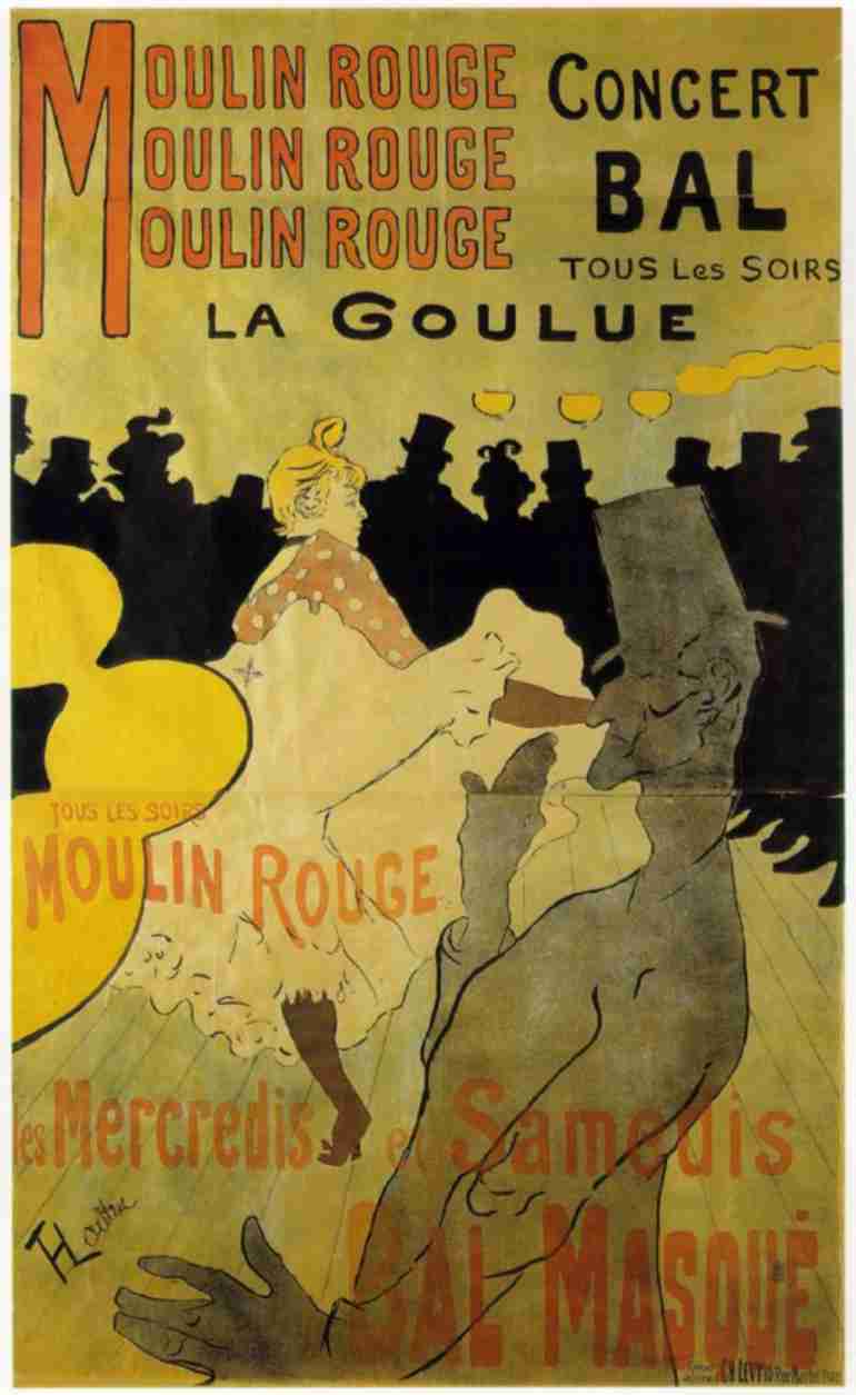
This Toulouse-Lautrec poster advertising the Moulin Rouge (circa 1890) is a prime example of graphic design, I think we could all agree on that, however it can also be classified as fine art (right...?). If you are of the mind that this is not fine art...then how could you say that this Kandinsky piece 'Squares with Concentric Circles' is fine art, while the TL piece isn't?

I guess somewhat inductive nature of me argument is not as universally applicable as I would like it to be, but basically, to the people that said "NO" - does this mean that there is absolutely nothing that can be classified as both graphic design as well as fine art? And to the people that said "YES" does this mean that everything that is classified as graphic design is "fine art"?

Where is Drissell??

For those of you that care, here is the official tally:

Should graphic design be considered fine art?

Yes - 6 (23%)
Depends on the skill of the designer - 5 (19%)
Yes, unless a specialty font is used then, no - 0 (0%)
Only if Helvetica is the font used in the design - 1 (3%)
As long as there is no type at all! - 0 (0%)
No - 14 (53%)

Total votes: 26

Read More......

Tuesday, June 16, 2009

Primordial Visual Communication


A Thunderbird pictograph located near Jeffers, Minnesota.
Photograph copyright © 2009 David M. Versluis (click image for a larger view).


About fifty miles north of the Iowa state line; near Jeffers, in southwestern Minnesota are the so-called Jeffers Petroglyphs. In a field, and surrounded by prairie grasses, you’ll find a modestly expansive surface of smooth Sioux quartzite bedrock that is exposed flush with the surrounding grade. However, look carefully and you’ll begin to discover carvings of hundreds of petroglyphic forms that are like those found in other places of the world. Many of these petroglyphs represent animals, birds, reptiles, figures, and signs, which prompt you to realize this is an important place. The result is a greater appreciation and respect for this specific site. A similar feeling and sense of place also occurs out West in the desert ecosystem of the Petrified Forest National Park near Holbrook, Arizona (one of my favorite places in North America). You’ll also find hundreds of petroglyphs there as well – surprisingly, they're not as old as some of those at the Jeffers site.


Some examples of petroglyphs at the Petrified Forest National Park in Arizona.
Photograph copyright © 2009 David M. Versluis (Click image for larger view).


Although the oldest carvings date from 7000 to 9000 years ago one of the newest petroglyphs at the Jeffers site is the Thunderbird. Apparently, the serrated lines of the wings suggest that Native Dakota people carved it about two hundred years ago. It is believed, this creature is so powerful that it can produce thunder by flapping its wings. The images were made by the subtraction and pecking method of hammering a pointed stone chisel to create incised linear shapes that form pictographs. The pecking technique disrupts the surface patina of the stone to reveal the lighter color and hence, the contrast.

The Jeffers Petroglyphs' site is maintained by the Minnesota Historical Society (click).

Scientific study seems to indicate, although not necessarily in strict linear sequence, that early pictographs and pertroglyphs unfolded in a couple of different ways. In A History of Graphic Design (1983), author Philip Meggs says, “First, they were the beginning of pictorial art. The objects and events of the world were recorded with increasing fidelity and exactitude as the centuries passed. Second, pictographs also evolved into writing. The images, whether the original pictorial form was retained or not, ultimately become symbols for spoken-language sounds” (Pg. 5).

If you were going to write about the history of graphic design would you start with the petroglyphs?

Read More......

Saturday, June 13, 2009

Jessica Helfand's 'Open Letter to Design Students'

In addition to Dordt's very fine 2009 commencement speech, 'Children of the Light' by communication professor Charles Veenstra, I thought I'd call your attention to a recent post on Design Observer by Jessica Helfand. Please read through to the last paragraph. Ms. Helfand is one of the founding editors of Design Observer.

As a side note, I have tried to do many of the things she advocates and it has served me well in the 30 years that I've been affiliated with design. My suggestion is to see if you can tailor her insights to your personal circumstances. (Click here to get to her post). For our alumni and other followers of this blog perhaps you may have your own 'words of wisdom.' If so, please leave a comment, or, let us know what you think about Helfand's piece.

Read More......

Wednesday, June 10, 2009

Design History: Unexpected Art Deco


Photographs for this post copyright © 2009 David M. Versluis

It’s a great delight when you come across public art in unexpected places especially in small towns on the Midwestern prairie of the United States. This happened several years ago on our way to Minneapolis and Saint Paul from Sioux Center, Iowa. About 90 minutes into the trip, on highway 60, you come to Windom, Minnesota (pop. approx. 4,220). On the east side of the road just past downtown you’ll see the Municipal Power Plant with a carved limestone cornerstone declaring 1936. What’s most unusual about the building are the three carved Art Deco style bas-reliefs facing the road.…

In a moment I’ll talk a little more about the artwork, but first, some information about Art Deco. Marcia Loeb in her book, Art Deco Designs and Motifs describes Art Deco as, “… the most typical artistic production of the nineteen-twenties and thirties. This name comes from the large exhibition, held in Paris in 1925, called the Exposition Internationale des Arts Décoratifs et Industriels Modernes.” You can characterize the art of this period as very eclectic and I was reminded of this with Paul’s previous post —a poll about art styles/movements. In other words, about Art Deco, Loeb says, “Its sources included turn-of-the- [twentieth] century art nouveau, most of the important artistic movements that followed (Fauvism, Cubism, Futurism, Expressionism) and such archaeological interests of the day as ancient Egyptian and Mayan art.”

Loeb further explains, “One of the chief unifying factors of Art Deco is the emphasis on geometrical patterns. Another, related to the first, is the full acceptance of the machine age and the consequent abandonment of the traditional barriers between fine and applied [design] art.”

As I’ve said on occasion, in class, Art Deco was not the only art movement trying to break down the barriers between art and design — also in the twenties, the German Bauhaus and the Dutch De Stijl were essentially doing the same thing by incorporating all facets of art and design from architecture to graphic design, photography, product design, textiles, painting, sculpture, ceramics, theatre arts, and interior design.

From Loeb’s concise description
of Art Deco, the style, certainly seems fitting for the Windom Municipal Power Plant because of it's industrial purpose. This building was intended to function as a utility in order to benefit the whole community as well as being a sign of progress during the economic depression era of the thirties.


Energy — after sculptor Ulric Henry Ellerhusen


Light — after sculptor Ulric Henry Ellerhusen


Electricity by the late Don Gregory

The most knowledgeable person about the Power Plant Art Deco reliefs is Lucille Lewis. In the late 1980s, Lewis, who was then the Windom correspondent for the Worthington Daily Globe wrote a couple of articles about the Power Plant. In a copy of a June 1, 1988 article, obtained from the Cottonwood County Historical Society, Lewis states:

In 1936 the city of Windom constructed a power plant and contracts for the building were given to Carlstrom Construction of Mankato [Eric A. Carlstrom Construction Co.]. Thinking the simple outside walls needed some decoration; the contractor had two Art Deco panels Energy and Light, carved and placed under the windows.

In the City Council minutes of 1936, there is no mention of the decoration nor the sculptor. The newspapers of the day only tell about the sizes of the dynamos and the amount of electricity generated at the plant. No one seemed interested in the outside panels. There are also no photographs or blueprints of the building.

Some years later,* the city once again asked Carlstrom to add to the powerhouse. This time Carlstrom contacted his friend Professor Don Gregory of the newly founded art department of Gustavus Adolphus College to make a matching panel titled Electricity. … [Gregory was paid $200 for the commission]

Gregory was a graduate of the Minneapolis School of Art and had worked with Carl Milles, a Swedish sculptor. Many of Gregory’s works are in the St. Peter/Mankato area, such as a mosaic on Grace Lutheran Church in Mankato and works on the Mankato Telephone Building, according to his wife. He retired from the college in 1980 and died in September 1985.…
*When I asked her, Lucille said the addition was added in the late 1930s (c.1938).


The Windom Power Plant as it stands today. In c.1938 an addition was added to the existing building, on the left side, where the Don Gregory relief sculpture is located. The original windows have been removed and paneled over.

Actually, the contractor in the 1930s did a fine job of merging the addition to the existing structure. Only a careful observer will probably notice some differences mostly in the symmetry of the building. Remarkable however, is the work of Don Gregory whose added relief carving matches incredibly well with the other two and yet seems to convey Gregory’s personality and classic style. I may do further research to determine if the two original reliefs were completed as part of the Works Progress Administration (1935-39) during President Franklin D. Roosevelt’s Administration. The WPA provided jobs to unemployed workers, including artists and designers, on public projects sponsored by federal, state, or local governmental agencies.

As a side note, The Windom Municipal Power Plant is registered in the Barbara Baer Capitman Archives. and it should be researched too. The Theater’s interior designer and artist is John Also registered in the Archives is the 1930s, Art Deco style State Theater in WindomMoede. Although over 100 years old Mr. Moede is still living and resides in a Windom rest home — Do I have any volunteers to help me?

Read More......

Tuesday, June 9, 2009

Creativity Aid

Have designers block?
Visit creatiu.com

This website contains 'Cool Sites, Cool Videos, Design Schools, Trends'
This portfolio of interesting website and well done videos is definitely helpful as we blog and journal our creative summer ideas to help us through our next year of studies.

Read More......

Poll results...

What is your favorite Art movement?
Neo-Classicism
0 (0%)
Romanticism
0 (0%)
Realism
0 (0%)
Impressionism (etc)
3 (30%)
Art Nouveau
2 (20%)
Cubism
1 (10%)
Expressionism
0 (0%)
Surrealism
2 (20%)
Abstract Expressionism
1 (10%)
Pop Art
1 (10%)

Votes so far: 10

So...Impressionism (etc) has it! With 3 of the 10 votes....a very poor voter turnout.

Read More......

Wednesday, June 3, 2009

Website and Blog comments

I am doing a new project of making a site of all the images that I find inspiring for design. Feel free to comment and follow my blog. Click here.
I am also working on a flash website to become a portfolio of photography and artwork.
It is currently under construction but I would love any comments and suggestions you have to offer. Portfolio.

Read More......

Websites and Google

I am not sure how many of the designers are presently working on web design but I found that this website is a very helpful tool in Marketing the company/product or just getting more traffic onto your site.
https://www.google.com/webmasters/tools/docs/en/about.html

I hope this is helpful

Read More......