
David Versluis
A Collage piece from the “Icon Series”
Collage media: graphite, prismacolor, gold paint, colored paper, refuse printed material, and drawing on 22 x 30 BFK Rives Cream, 1980.
From a private collection.
Photo credit:
Joan Mondale attends the Department of Labor’s “Bread and Roses” event.
Photograph Collection 1980, Location no. Walter F. Mondale Papers; Minnesota Historical Society, used with permission.
The basis for the “Icon” series was finding a small elm tree growing in one of the spiked holes of a concrete parking lot car bumper. And after pulling it out, its roots were bound tightly in a cylindrical form.
The passing of Geraldine Ferraro several weeks ago prompted me to think, among other things, about this piece once again.
This piece was one of several in the series, which was exhibited as part of a group show in the early 1980s at Bergsma Gallery in Grand Rapids, Michigan. This show was the first show in the gallery when it relocated in prominent commercial space in the Amway Grand Plaza Hotel.
Highlighting the opening reception was a surprise visit by Joan Mondale who was in town as a keynote speaker for a National Organization of Women (NOW) Conference. Mondale was the wife of former Vice President Walter Mondale who at that time was laying the foundation for the Democratic Party nomination for President. That evening she cordially greeted me as we shook hands and said, “I like your work,” for which I politely thanked her.
Saturday, April 30, 2011
Joan of Art
Friday, April 29, 2011
René Clement: “Promising Land” (how a Dutch photographer sees Northwest Iowa)

Phohograph by René Clement © 2011, all rights reserved
After photographing in Orange City, Iowa, for five years, the book project Promising Land has been published and is available for sale. René Clement, a New York City-based Dutch photographer, will exhibit 38 photographs May-July at Dordt College Campus Center Art Gallery in Sioux Center, and do book signings May 18-21 in Orange City.
Here’s the news release written by Lisa Burg:
Dutch photojournalist from New York releases book on local culture.
Photography exhibit and book signing to be held in May in Sioux Center and Orange City.
After visiting Sioux County 10 times over the past five years to capture photographs for his book on Dutch culture, New York City-based photojournalist René Clement returns in May for an exhibit and book signing of his recently-published Promising Land. The Dordt College Department of Art and Design will host an exhibit of 38 of Clement’s photographs from May through July, with a reception and book signing on May 18. In addition, Clement will be on hand in during the Tulip Festival, May 19-21, for book signings at Holland House Interiors on main street Orange City.
Locally, Sioux County has long been known for its Dutch heritage. But when Clement “stumbled upon” Orange City he was fascinated with the discovery of a place where community members openly celebrate and display that heritage. As a Dutch immigrant himself, he found the town and its history intriguing.
“I had unexpectedly found myself in a small town peppered with windmills, houses with Dutch stair-step gable fronts, and an abundance of tulips” said Clement of his first trip through the town. “And since it was a Sunday, there was not a living soul to be seen on the streets of this small community guided by an unshakable Dutch Reformed tradition. My curiosity was peaked.”
His curiosity pushed him to evaluate the importance of roots, cultural influences and how they shape individual identity, and what happens when people share a common cultural legacy. As he studied the community, he found the inspiration for his book, Promising Land, a series of portraits and landscapes featuring people in traditional Dutch attire against a modern day America backdrop.
“Because I wanted to honor my subjects” desire to connect with their Dutch ancestry, I emphasized traits many of them held in common “blond hair and blue eyes, similar facial structure, and a timeless confidence reflected in their collective gaze,” said Clement.
The Dordt College department of art and design was awarded $3,700 from the Consulate General of the Netherlands for partial funding of an exhibition and publication of Promising Land.
The exhibit featuring Clement’s work will be on display at Dordt College from May to July 2011. A reception and book signing will be held at the exhibit/gallery on Wednesday, May 18, from 7-9pm. The exhibit and reception is free and open to the public. The Campus Center Art Gallery is open every day from 8am to 5:30pm.
Clement will hold book signings each day of the Orange City Tulip Festival, May 19-21, from 11am-3:30pm and 5:30-8pm at Holland House Interiors on Central Avenue in Orange City. The book is also sold through the web site reneclement.com.
René Clement is an award-winning photographer. He has been based in New York City since 1998. He works for newspapers and magazines, and is a member of the Hollandse Hoogte agency in Amsterdam. He spends much of his time working on long-term projects. His work has been selected for Time Magazine Pictures of the Year (2003) and the Dutch Zilveren Camera competition.
Wednesday, April 27, 2011
The Bridge as a Relational Metaphor

Image from iStockphoto.
The bridge can be thought of as a relational metaphor about establishing connections. Driving along on the Zeeland Bridge, which is the longest bridge in the Netherlands, you feel as if you’re magically riding on water. Writer/designer, George Nelson writes insightfully about bridges in his book, How to See:
Bridges
Of all the structures and machines used for going places, the bridge is unique. Unlike the road, an earthbound strip, the bridge leaps, taking imagination with it. Like the plane, it defies gravity, but noiselessly. It “moves” with infinite grace without going anywhere. It never causes visual pollution; it soars across rivers and chasms, enhancing natural environments. The names of great bridge builders [and bridges] are remembered.
The beauty of bridges, as we perceive the best of them, is related to the fact that they are a single-purpose design, and that all of their components are directly related to this one purpose. Everyone understands what a bridge is and does. The same is true of aqueducts.
Technology, while continually refining bridge design, has little effect on our response: The Pont-du-Gard, built by the Romans a thousand years ago, is as satisfying an ornament in the French landscape today as it ever was. … [1]
Read More......
- Nelson, George. How to See: A Guide to Reading Our Manmade Environment. Boston, Toronto: Little, Brown and Company, 1977. 129-33. Print.
Sunday, April 24, 2011
clean and elegant monochromatic relationships

Herbert Bayer (1900-1985)
Concentric Circles
powdercoated aluminum 6061 T5
ca. 1969/2007
84-108 inches (7-9 feet)
Peyton Wright Gallery, Santa Fe, New Mexico
photograph by versluis
Within this structure of a formal rectangular cube are values of neutral white, which are physically rendered as shades and tints. The sculptural circles form stepped and regular concentric circular rhythms as they progressively reduce asymmetrically in scale to punctuate a circular void. On the other hand, one can also sense amplification as the concentric circles move from smaller to larger scale. The sculpture becomes a backdrop for the variations in lightness and darkness by reflecting the environs surrounding this piece.
The dappled light from the tree foliage creates patterns and interesting color combinations that unify color relationships that seem to suggest both literal and an illusion of space.
Friday, April 22, 2011
AIGA Dordt College student group: second anniversary

Chef Giovanni Romano in the kitchen at the Fruited Plain Café, Sioux Center, Iowa.
Photo credit: Jenn Ackerman for The New York Times.
Today is the second anniversary of the dcaiga blog and this site has gained regular visitors from all over the world. In addition to this blog, the AIGA Dordt College Student Group has held monthly events with guest designers who come to campus to talk about the world of graphic design and the work that designers engage in.
Either after the presentation or before, the students and I treat our guest designer to dinner at the Fruited Plain Café in their Backroom Bistro where on Wednesday evenings an all-you-can-eat spaghetti dinner is served. Last September our first guest was Erik Rodne who’s a versatile designer with HenkinSchultz in Sioux Falls, South Dakota. Erik is young and smart and came early that day to help me with students’ critiques. As we began to eat our meals Erik commented that the pasta was done to perfection! I appreciated the fact that Erik noticed because in small-town NW Iowa, Italian food is perhaps the last thing you would expect. We sent word back to the kitchen to thank the cook, Giovanni.
Just recently I was reminded of the exceptional food that’s served here at the Backroom Bistro when my daughter in the Twin Cities asked if we had seen the article about Giovanni Romano in The New York Times. (The New York Times. Yes!)
Here’s the article: http://www.nytimes.com/2011/04/03/us/03iowa.html
Wednesday, April 20, 2011
hot type and hot dogs full of mustard

“Coney” a photograph by Keith Roghair, Dordt College senior; Doug Burg, instructor. Photo is used with permission – all rights reserved. (select image for larger view).
Although taken during the off-season this picture seems to reflect an organized cacophony of typographic styles found in the amusement park at Coney Island, New York. The strength and order of this type works for emotive effect and utility and not the intentions of educated designers. For the most part the audience are common folk. Whether the work signifies good taste or bad taste, the impact is interesting, compelling and alive.
Seeing this picture reminded me of this poignant passage from The Seven Storey Mountain. The author Thomas Merton, thinking back as a young man to the 30s, contrasts the forebodings about world war in Europe with the fond memories of hot dogs and beer at Coney Island. Merton writes:
The Europe I finally left for good, in the late November of 1934, was a sad and unquiet continent, full of forebodings.
Of course, there were plenty of people who said: “There will not be a war….” But Hitler had now held power in Germany for some time, and that summer all the New York evening papers had been suddenly filled with the news of Dollfuss’ murder in Austria, and the massing of Italian troops on the Austrian borders. It was one of the nights when I was down at Coney Island, with Reginald Marsh, and I walked in the whirl of lights and noise and drank glasses of thin, icy beer, and ate hotdogs full of mustard, and wondered if I would soon be in some army or other, or perhaps dead.
It was the first time I had felt the cold steel of the war scare in my vitals. There was a lot more to come. It was only 1934.
And now, in November, when I was leaving England forever the ship sailed quietly out of Southampton Water by night the land I left behind me seemed silent with the silence before a storm. It was a land all shut up and muffled in layers of fog and darkness, and all the people were in the rooms behind the thick walls of their houses, waiting for the first growl of thunder as the Nazis began to warm up the motors of a hundred thousand planes.
Perhaps they did not know they were waiting for all this. Perhaps they thought they had nothing better to occupy their minds than the wedding of Prince George and Princess Marina which had taken place the day before. Even I myself was more concerned with the thought of some people I was leaving than with the political atmosphere at that precise moment. And yet that atmosphere was something that would not allow itself to be altogether ignored. [1]
- Merton, Thomas. The Seven Storey Mountain. New York: Harcourt, Brace and Company, 1948. 127-128. Print.
Saturday, April 16, 2011
van de Velde Behrens & Guimard — phytomorphism (plant patterns)


Pictured clockwise starting top left:
Leeuwarden Railway Station, interior column tile detail, designer anonymous, c. 1860s
Leeuwarden, Friesland, The Netherlands
© 2011 photograph by versluis
Peter Behrens
Ornamented initials to match the Behrens-Schrift type designs
for Rudhard Typefoundry, 1902. Image source: Mosley, James. “St Brides Printing Library.” Baseline International Typographics Journal, St Bride’s Issue (1990): 32. Print.
Henri van de Velde
Double title page for Ecce Homo, written by Friedrich Nietzsche, 1908. Image source: van de Velde. Nietzsche, Fr., “Ecce homo.” Ketterer Kunst. N.p., 17 Nov. 2008. Web. 18 Apr. 2011; http://www.kettererkunst.com/details-e.php?obnr=410805351&anummer=348.
Hector Guimard
Entrance to a Paris Métro station, c. 1900
“le style métro” — railings, balustrades, and lamp-holders
© photographs by versluis
Perhaps the insights of Phil Meggs can help us understand some of the contributions and historical importance of H. van de Velde as a design educator and P. Behrens who began to move design toward more objective geometric forms.
Although van de Velde became an innovator of Art Nouveau, he was far more interested in furthering the Arts and Crafts philosophy than in innovative style as an end in itself. After the turn of the [twentieth-] century, his teaching and writing (The Renaissance in Modern Applied Art, 1901; A Layman’s Sermons on Applied Art, 1903) became a vital source for the development of twentieth-century architecture and design theory. An example of his pedagogy is his observation that when a shadow is cast, a complementary form is created on the light-struck side of the shadow’s outline, and that this “negative” form is as important as the object casting the shadow. He taught that all branches of art—from painting to graphic design, and from industrial design to sculpture—shared a communal language of form and an equality of importance to the human community. Appropriate materials, functional forms, and a unity of visual organization were demanded. He saw ornament not as decoration but as a means of expression that could achieve the status of art. [1]
- Meggs, Philip B. A History of Graphic Design. 2nd ed. New York: Van Nostrand Reinhold, 1992. 209. Print.
Wednesday, April 13, 2011
AIGA Nebraska: “Me, Myself and Design 2011”

Portfolio reviews starting top left clockwise: Senior, Mark Veldkamp with reviewer Craig Hughes, Ervin & Smith; Senior, Addie Krosschell and Justin Kemerling, The Match Factory; Junior, Ellie Dykstra with Erikheath Thomas, Pen-Link, Ltd.; Junior, Annemarie Osinga with Julie Lingbloom, David Day & Associates. Top left photograph courtesy of Paul Berkbigler, Paul Berkbigler Design and Illustration.
Annually, the education arm of AIGA Nebraska organizes an invaluable event called Me, Myself and Design. This year MMD took place on Saturday, 9 April 2011, with a very good turnout in Omaha hosted by Metropolitan Community College—Elkhorn Valley Campus (faculty Jim Wolf and Luann Matthies). This fine event invites graphic design students from various college programs in the region to attend meetings with design professionals. This year the event introduced the theme, “The Future You” to students. Obviously, the focus is on what students needs to know about finding a job and the schedule for the daylong event begins with Q and A breakout sessions with students meeting the professionals. The event culminates, perhaps the highlight, with student portfolio reviews by guest professionals later in the afternoon.
Here are a few notes from the morning panel session that I attended:
“Client’s need design thinkers [problem solvers].” —Anne Maguire, Mutual of Omaha; Justin Schafer, Mutual of Omaha; Stephanie Jarrett, Ervin & Smith; Ben Swift, NoNoArt. All of these designers serve on the AIGA Nebraska board of directors.
Résumé advice for students:
Should have good typographic structure and layout and be easily readable.
Internship advice for students:
As an intern try to develop a role to play while on the job by taking the initiative and asking for work. Don’t be afraid of politely asking for help.
In the afternoon I went to the panel of designers affiliated with so-called independent design firms. This panel featured: Aaron Jarzynka, Local Hero Design; Donovan Beery, Eleven19; John Gawley, Omaha Publications; Clint Runge, Archrival; Adam Torpin, Oxide Design Co. One of points of discussion was about showing passion for design, which reminded me of correspondence I had several years ago with Mary Darby, president of Pulluin Software. I tell students her comments about portfolios and interviews, which are as follows:
Speaking from an employer’s perspective,Read More......
I have some definite criteria I use when looking at a candidate for a team position. There are specific elements I feel are helpful in a portfolio—and it is not just a final product, far from it in fact. Over the past few years, I have really learned to look at the process a person follows, their ability to make decisions independently, their proactive approach, teamwork capabilities, critical thinking, communication skills, ability to self-direct, passion, commitment, etc. If the final product is great but I can't see any evidence of the other elements I mentioned, I am not interested in that person as a team member. If the final product is just pretty good but I can see evidence of the things I listed above—I will choose the “pretty good” product over the “great” product every time and I think most employers would agree with me. There are ways to demonstrate these things in a portfolio.
[For instance] passion comes from love for the work itself (the task, process the person takes, the research they do, the torture and angst they go through to reach an end result, etc.) and it also comes from a desire to be part of “something” great.In regard to measuring passion for the work,
When reviewing a portfolio and when interviewing, I want to see evidence of an acknowledgement of the needs of the project or the client, the process, the angst, the struggle, the identified foundation or solution they came to (why this style—why that color—) and why they chose that solution—some collaboration with others if appropriate, then their thoughts about the end-product and how they feel it meets the needs identified in the beginning of the whole process. Someone who is passionate will go through all of this—and be happy to articulate it or show it in a portfolio. If it is not in the portfolio but on interview they can explain it and I can see facial expressions and body language that would indicate how engaged they are. Passion does not mean a person is overly dramatic, or loud or anything like that—it means you can see the excitement they have for their work. … [1]
- Darby, Mary. “Portfolio Development.” Message to the author. 2005. e-mail.
Sunday, April 10, 2011
Herbert Bayer’s “Chromatic Gate”

Herbert Bayer
Chromatic Gate
Aluminum 6061 T5 with automobile paint
ca. 1975/2007
144" x 168" x 48"
Peyton Wright Gallery, Santa Fe, New Mexico
photograph by versluis
Herbert Bayer’s “Chromatic Gate” suggests both architecture and sculpture, which interestingly helps define open spaces and entices one to step through space. This effect is enhanced by the stepped configuration of the brightly multicolored posts and lintels that form a horizontal and vertical rhythmical pattern that depending on your perspective ironically reduces or expands ones perception. On the other hand, the piece is a painting in three-dimensional geometric shapes, which emphases proportion, scale, pure hues, and environmental placement.
Peyton Wright Gallery in Santa Fe is a representative of the estate of the Bauhaus master Herbert Bayer. The Gallery has published, on their website, the following brief but concise biography about Bayer:
Herbert Bayer (1900-1985) Estate
Austrian-born artist Herbert Bayer (1900-1985) received no formal artistic education until he discovered the theoretical writings of the artist Vassily Kandinsky, as well as Walter Gropius’ 1919 Bauhaus manifesto, which declared the necessity for a return to true creativity and inspiration through crafts. Bayer traveled to Weimar to meet Gropius in October of 1921 and was immediately accepted into the Bauhaus. There, he was deeply influenced by the instruction of Kandinsky, Johannes Itten and Paul Klee.
Throughout his career, Bayer’s achievements in both the applied and fine arts exhibited a unique ability to combine the needs of industry and the structure of Bauhaus architectural style with the sensibility of the avant-garde and the expressiveness of his life-long fascination with nature. Of all his works, including photomontage, installation, earthworks and environmental art, Bayer’s paintings are perhaps the least well known. However, for Bayer, painting was “the continuous link connecting the various facets of [his] work. [1]
- “Herbert Bayer (1900-1985) Estate.” Peyton Wright. Peyton Wright Gallery, n.d. Web. 10 Apr. 2011.
.
Wednesday, April 6, 2011
Some notes on John Vander Stelt: A Renaissance Man

Mr. John Vander Stelt was our guest designer and presenter for our AIGA Student Group event held on Wednesday, March 30. John works as a creative director, graphic designer, illustrator, artist, husband, and father. We invite you to check out John's blog. Colleague Matt Van Rys is again our fine purveyor of meeting notes, which are as follows:
John has lived in Sioux County his whole life and has been a part of the art community in Northwest Iowa for a long time. Coming from a creative family, it was no surprise that as a child John was drawing a recognizable as a Blue Jay before kindergarten. John continued as an artist by attending Northwestern College in Orange City, Iowa as an Art Education major and enjoyed his student teaching experience, but didn’t feel it was his passion.
After college, John applied at K-Products and started as a Graphic Designer. Early on, he worked primarily designing and preparing artwork for promotional products, such as t-shirt screen printing and embroidery for hats.
After about two years, John moved to the catalog and creative department. This allowed for additional creative freedom and more direct client interaction. On many catalogs, John and his team would do up to six ideas for the client; often changing yearly due to evolving corporate tastes. A suggestion John has for students is to listen to your clients and design to best meet their objectives for the project; designing within their limitations while maintaining your creative freedom. John often uses Typography to express creativity through font choices, color, texture and such. Using type, while understanding the relationship between letters and utilizing positive versus negative space can exhibit the difference between a designer and an amateur.
About three and a half years ago, John left K-Products and began working as the Creative Director for Pizza Ranch, moving from a large corporate department to being the sole creative force behind a brand. While at K-Products, John worked with a variety of brands and had some concerns that working with just one brand would eventually get stale. However, just the opposite is true, and working with rebranding and branding has been very rewarding. John expressed that his job at Pizza Ranch was really an answered prayer.
John has developed the general direction for the Pizza Ranch brand and uses subtle techniques such as photo edges, distressing textures and textured typography to carry the brand through various pieces. This isn’t a change on a dime approach, but updating stuff as needed while continuing to re-evaluate whom Pizza Ranch is marketing to. For example, John has been adding more photos of people to help the customer relate better to the pizza product and the restaurant experience.
As the key creative person, John has a lot of creative control and also has to wear many “hats”, including writing the copy for his work, working on marketing plans, designing graphics for a Nascar stock car, directing photo shoots and even assisting with art direction on a TV commercial and an upcoming website update.
Monday, April 4, 2011
Dordt College Art Committee: Concept proposal for an East Campus Sculpture

Illustration and maquette by David Versluis. Piece is entitled: “Enlaced,” © 2011.
Scale: eighteen feet high x seven feet wide.
The design of this sculpture is guided by a sense of an intertwining of a Christian perspective that’s found within Dordt College’s academic community. This sculptural piece tries to convey this aspect by weaving together seven upright metallic forms. The individual upright pieces are grouped into a regular pattern and yet suggest variety with unity through the columns of different heights. The goal is to develop a symbolic respite on campus, whether the piece is placed within a new landscaped sculpture garden or simply juxtaposed with existing buildings and pedestrian walkways.
The rusty patina of steel surface suggests an honest character produced by natural environmental elements. COR-TEN® steel forms a stable rust-like appearance when exposed to the weather for several years.
The sculpture is comprised of seven columns, which to some extent allude to the Hebraic biblical symbolism of seven branches of the traditional temple lamp-stand called the menorah (Exodus 25:31-40). The menorah is thought to symbolize the burning bush as seen by Moses on Mount Horeb (Exodus 3). In addition, the design of the menorah suggests the six branches of human knowledge, which are symbolically guided by the seventh branch representing the light of God.
Psalm 19 talks about the ways in which creation reveals God’s patterning in beautiful poetic language. Emphasizing the import of the “burning bush” analogy Calvin Seerveld writes in Rainbows for the Fallen World:
“Psalm 19 is enough to leave you limp. It makes vivid that all creation is a burning bush of the Lord God, revealing his just, merciful presence by the praise of countless creatures. It sings the glory of the law and ordinances by which Yahweh’s mouth rules all goings on in history with wisdom and compassion … and … it ends by confessing … that in keeping the law and in doing what’s right there is no justification … [God] save us! … Set us free from our sinful selves to be your willing servants, Lord!”
This sculpture celebrates the common reality found in Psalm 19 in which all human beings exist. If implemented a sculpture area would be a public space — a place where the Dordt community could congregate, meet, talk, and interact.
Referenced materials:
Strauss, Gideon. “Wonder, Heartbreak and Hope.” Capital Commentary. The Center for Public Justice, 28 Jan. 2011. Web. 23 Feb. 2011.
Seerveld, Calvin. Rainbows for the Fallen World: The Aesthetic Life and Artistic Task. Downsview, Ontario: Toronto Tuppence Press, 1980. 17. Print.
Friday, April 1, 2011

herbert bayer’s monochromatic space-painting and the design of self-contained sculpture
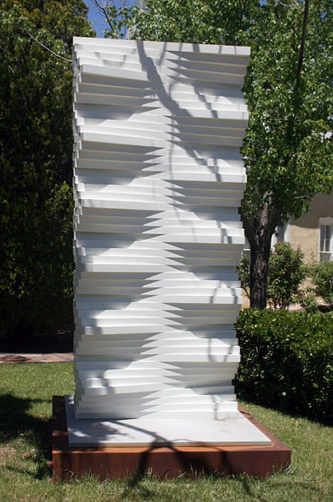
Undulated Wall
Herbert Bayer (1900-1985)
Powdercoated aluminum on a COR-TEN® steel base.
c.1967/2007
Bayer’s sculpture was photographed May 2009 at the Peyton Wright Gallery in Santa Fe, New Mexico. Photograph was taken with the gallery’s permission. We wish to thank the gallery for their graciousness. Photography by versluis by ©2009.
Although written in the context of a different project what Bayer says below seems apropos for this sculpture as well:
vistor, walking around…, experiences varying views and impressions. by walking through space-painting, he becomes participant in space-time concept.… changing shadows, the tree, [retinal vibrations], contribute to impressions.… [1]
- Bayer, Herbert. Herbert Bayer: Painter, Designer, Architect. New York: Reinhold Publishing Corporation, 1967. 140. Print.