Monday, February 7, 2011

AIGA Student Group presentation — Sarah Franken, graphic designer


Poster design by Sarah Franken © 2011

Sarah Franken will be our next guest designer for Wednesday, February 9, from 4 to 5 p.m. in CL room 1223. The focus of her presentation will be about Print + Environmental Graphic Design. There will be a time for Q and A as well.

Sarah mentions that:

My life and work since graduation from Dordt in 2006 has involved: Chicago, museums, public transit, cats, concerts, and striving for great design. Extra special emphasis on the 2nd and last items on that list, since that’s what you all might be the most interested in. I’ll be talking about my time working as a graphic designer in a museum setting and the kind of design skills I’ve learned, some of which I never expected or even knew I needed to learn. Hope you’ll join me.

Here’s some more basic info:
• Here’s a link to my portfolio.
• I currently work at the Science Museum of Minnesota as a Graphic Designer.
• I’m a member of AIGA Iowa.
• Previously, I worked at The Field Museum (of Natural History) in Chicago.

Read More......

Sunday, February 6, 2011

Quotations on creativity — Henry Wadsworth Longfellow

Art is the gift of God, and must be used
Unto His glory.…

—Longfellow

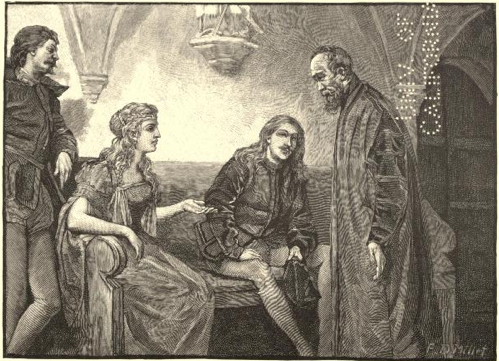
This quote is found in a dramatic lyrical poem by Henry Wadsworth Longfellow entitled, Michael Angelo. Longfellow’s illustrated book was published in 1884.

Longfellow, Henry Wadsworth. Michael Angelo. Boston: Houghton, Mifflin and Company, 1884. 25-26. University of California Libraries/California Digital Library. Web. 5 Feb. 2011.


Head-Piece engraving from the book; S.L. Smith, illustrator. p.7


A scene from the poem: “A Chapel in the Church of San Silvestro. Vittoria Colonna, Claudio Tolommei, and others.” The noblewoman, Vittoria Colonna has received the Pope’s blessing to build a new convent. Caption: Vittoria Colonna, Michael Angelo, and others. In the Chapel of San Silvestro. “If friends of yours, then are they friends of mine. Pardon me, gentlemen. But when I entered I saw but the Marchesa.” Book engraving was illustrated by F. D. Millet. p. 23

The scene begins as the building committee is meeting with Michelangelo. The scene unfolds with Vittoria and Michelangelo discussing the design of the convent. Here are passages from pages 25 and 26 that reveal Longfellow’s quote (I’ve used bold face for emphasis):

Vittoria.
But that
Is not what occupies my thoughts at present,
Nor why I sent for you, Messer Michele.
It was to counsel me. His Holiness
Has granted me permission, long desired,
To build a convent in this neighborhood,
Where the old tower is standing, from whose top
Nero looked down upon the burning city.

Michael Angelo.
It is an inspiration!

Vittoria.
I am doubtful
How I shall build; how large to make the convent,
And which way fronting.

Michael Angelo.
Ah, to build, to build!
That is the noblest art of all the arts.
Painting and sculpture are but images,
Are merely shadows cast by outward things
On stone or canvas, having in themselves
No separate existence. Architecture,
Existing in itself, and not in seeming
A something it is not, surpasses them
As substance shadow. Long, long years ago,
Standing one morning near the Baths of Titus,
I saw the statue of Laocoön
Rise from its grave of centuries, like a ghost
Writhing in pain; and as it tore away
The knotted serpents from its limbs, I heard,
Or seemed to hear, the cry of agony
From its white, parted lips. And still I marvel
At the three Rhodian artists, by whose hands
This miracle was wrought. Yet he beholds
Far nobler works who looks upon the ruins
Of temples in the Forum here in Rome.
If God should give me power in my old age
To build for Him a temple half as grand
As those were in their glory, I should count
My age more excellent than youth itself,
And all that I have hitherto accomplished
As only vanity.

Vittoria.
I understand you.
Art is the gift of God, and must be used
Unto His glory.
That in art is highest
Which aims at this. When St. Hilarion blessed
The horses of Italicus, they won
The race at Gaza, for his benediction
O’erpowered all magic; and the people shouted
That Christ had conquered Marnas. So that art
Which bears the consecration and the seal
Of holiness upon it will prevail
Over all others. Those few words of yours
Inspire me with new confidence to build.
What think you? The old walls might serve, perhaps,
Some purpose still. The tower can hold the bells.

Michael Angelo.
If strong enough.

Vittoria.
If not, it can be strengthened. …
Soli Deo Gloria

Read More......

Wednesday, February 2, 2011

Reminiscences about “Plucked Chicken Press” — founded in 1978 by Will Petersen and Cynthia Archer — specializing in lithography


Front and back of the Plucked Chicken Business Card, c.1980 — from the collection of David Versluis

One afternoon, perhaps in the fall of 1980, while researching art internship sites for students at Trinity Christian College, Palos Heights, Illinois my colleague Jake Van Wyk and I visited Plucked Chicken Press and met with Will Petersen to discuss the possibility of providing a student internship. Cynthia Archer was there to greet us as well as we entered the workshop, which was housed on the second floor of an old industrial building. Petersen was professional and friendly and with a sense of humor — he was a genuine character. We were impressed with his collection of lithographic stones. The press was located in downtown Chicago just west of the fork in the Chicago River.

Along with the “Plucked Chicken” logo and printer’s mark — the business card design is based on the printmakers numbering system, which is a good way of recognizing a limited edition original art print. Usually, but not always, for authentic prints the artist signs their name in the bottom right-hand corner on the front just below the image. On the bottom left corner opposite the signature the artist writes the number of each print in the edition. So, for example, a print numbered “3/30” signifies that it is the 3rd print out of 30 in the print run.

As published in the current Plucked Chicken Press website (courtesy of Oakton Community College, Skokie, Illinois) here’s a nice synopsis about the origins of the Plucked Chicken logo:

Plucked Chicken — The Journal and the Logo:

Plucked Chicken, a journal of art and poetry, was founded in Morgantown, West Virginia, in 1977. The Chicago poet and writer, Effie Mihopoulos, provided a glimpse of the journal’s birth in an April 1981 Serials Review:

The magazine was started because Petersen just having quit his teaching job [at the West Virginia University] (at 49) and feeling like a plucked chicken, had boxes and boxes of notes, letters, prose and other miscellanea that needed sharing, an outlet. He had a strong editorial background ranging from work with mimeographed magazines in grade school to [poet] Cid Corman's second Origin series; he was also associated with Bussei, which published [poet] Gary Snyder's first poems and [writer] Jack Kerouac's first haiku. Working with shapes one day, Petersen and his wife [Cynthia Archer] came up with one the size of a postage stamp that they liked — it looked like a plucked chicken, and since it seemed symbolic of the artist (a bird that can't fly, ready for the stew or to be barbecued, all goose bumps and no feathers), the name stuck.

The journal ended in 1980 with issue number six when Petersen and Archer moved to Chicago, but the name and logo continued to identify the press they had founded in 1978. Every print published by the Plucked Chicken Press was embossed with this logo.

Read More......

Saturday, January 29, 2011

Susan Jackson Keig, a pioneer in the development of graphic design


Photograph credits: Susan Jackson Keig’s c.1982 blind-embossed business card from the collection of David Versluis. The black and white portrait is from 27 Chicago Designers. 27 Chicago Designers. Vol. 34. Chicago: 27 Chicago Designers, 1982. Print. The late Morton Goldsholl was posthumously honored as a recipient of a 2009 AIGA Fellow Award. Photograph of Ms. Keig accepting the award on Goldsholl’s behalf. Ms. Keig received the 2002 AIGA Fellow Award.

“Once they find out what you can do, they can’t do without you.”
—Susan Jackson Keig, Designer

Susan Jackson Keig design consultant, Chicago, is listed by R. Roger Remington in his Graphic Design History Resource as a woman pioneer in the development of North American design. Currently, at age 92, Keig still manages her design practice.

I first heard Susan Jackson Keig speak in 1982 at the annual STA (Society of Typographic Arts) fall conference in Chicago, where she and Bruce Beck gave an presentation on the history of the STA. The duo recalled memories with first-hand anecdotes, presenting a commendable early history of Chicago graphic design. They focused primarily on the charter members of a group called “27 Chicago Designers.” The STA was a professional association of graphic designers based in Chicago and founded in 1927. Keig and Beck were both STA Fellows, interestingly—Keig was conferred in 1964 and Beck a year later in 1965.

In 1983 I had the opportunity to meet Ms. Keig at an evening STA event featuring a guest design manager (I think it was Christopher Pullman, WGBH). As I introduced myself she was friendly and gracious, with a sense of Southern hospitality—perhaps a reflection of her Kentucky roots. I still have the business card that she gave me that evening. I was teaching at the time at Trinity Christian College in Palos Heights, Illinois and Ms. Keig seemed interested in the school’s part of the family tree of the Dutch Reformed Church. At that time she was involved in the graphic identity for Chicago’s Prairie Avenue Historic District.

Ms. Keig has been honored as a Distinguished Alumna of the University of Kentucky College of Fine Arts where she graduated with a BA in art in 1940. In addition, in 2010 she was honored as an inductee into The University of Kentucky Hall of Distinguished Alumni. For the occasion the UK alumni association wrote a brief biography:

Susan Jackson Keig is an internationally recognized art designer in private practice. She also is a Fellow and past-president of the Society of Typographic Arts/American Center for Design, and she has lectured at Yale University, Heritage of the Arts SUNY and the School of the Art Institute of Chicago.

Some of her design projects include an LP record and album for Buckminster Fuller, a medallion from the Free Congress Foundation for Margaret Thatcher, and the Clare Booth Luce medallion from the Heritage Foundation for Ronald Reagan.

She is a leading authority on the Shakers, their village at Pleasant Hill, and has more than 3,000 photographs of Shaker Village. This is her 40th year of designing and producing the Shaker calendar for Pleasant Hill.

She taught at the Institute of Design, Illinois Institute of Technology in Chicago, has had one-woman exhibits in Louisville and New York, and is a Distinguished Alumna of the UK College of Fine Arts.
A few years ago at an AIGA Chicago evening event called “Fresh Talent 2008”. Ms. Keig, speaking to the audience, optimistically and wisely said, “Once they find out what you can do, they can’t do without you.” These are indeed encouraging words to take to heart as graphic designers.

Read More......

Thursday, January 27, 2011

Unity of text and form


MoMA gift store shopping bag, c.1999. Size: 8.5” x 11.5”
From the collection of David Versluis

The name MoMA is used to form consistent pattern of a continual recurrence, repetitious and rhythmical nature. To achieve contrast and variation the line The Museum of Modern Art, New York is used to emphasize the slightly off-center in this fairly rigid composition. The neutral typographic style of “Helvetica” and “corporate gray” reinforces the unity of text and form. (1)

  1. Ruder, Emil. Typography: a Manual of Design. New York: Visual Communication Books; Hastings House, Publis, 1981. 134-98. Print.

Read More......

Tuesday, January 25, 2011

Word and Image; posters from the collection of The Museum of Modern Art, 1968


Catalog dust jacket for Word and Image/Posters from the collection of The Museum of Modern Art/Selected and edited by Mildred Constantine/Text by Alan M. Fern. Published in 1968 by MoMA and designed by Massimo Vignelli, Pieter van Delft/Unimark International, 160 pages. Cover: detail from a billboard for Kessler, courtesy of Four Roses Distillers Company, New York. Catalog shown is from the collection of David Versluis.


Page shown is page 100 with the work of Ben Shahn (American), Ballets U.S.A. 1959 and Giovanni Pintori (Italian), Olivetti Tetractys. 1957.

Inside the cover on the dust jacket the teaser copy states:

In the last 100 years the poster has been an enormously popular art with a growing audience not only among professional enthusiasts, but the public at large. This pictorial history considers the poster as an art form interacting with other visual arts of its times as well as a social document.

The illustrations in this book are drawn from The Museum of Modern Art’s collection of over 2,000 posters, by artists working in all styles and media, from the powerful lithographs of the turn of the century to the “psychedelic” brilliance and technical ingenuity of today’s experimenters: work by Cherét, Bonnard, Lautrec, Mucha, Hohlwein, Kokoschka, Tschichold, Bayer, Kauffer, Cassandre, Picasso, Moscoso, Max, Gee, Shahn, Lionni, and Stella.

Alan M. Fern is Assistant Chief of the Reference Department, Prints and Photographs Division, the Library of Congress, Mildred Constantine who helped assemble the collection documented here in her former position as Associate Curator of Graphic Design, is Consultant to the Department of Architecture and Design and Special Assistant to the Director of the Museum of Modern Art.

Read More......

Thursday, January 20, 2011

Graphic identity for contemporary chic décor: Pavillon des Arts et du Design Paris 2010


These images show the graphic identity, poster, entrance signage, and interior spaces for the 2010 annual Pavillon des Arts & du Design Paris Showcase. Clicking on an image takes you to the source, but with one exception being the photograph in the upper right, which is by versluis and was taken from inside a Paris Metro Bus. The picture was taken last March 2010 as the vehicle was traveling on the rue de Rivoli and passing by the Jardin des Tuileries in Paris.

For some context, Kacee Taylor writes about the annual fair in the blog, Le Best of Paris:

This art and design exposition presents new pieces engineered by the biggest names in painting, sculpture, photography, drawing, tapestries, jewelry, antiques, and furniture to at least a crowd of 45,000 visitors. Internationally recognized, this 5-day event houses over 80 vendors sharing their unique visions, eclectic styles, and chic décor from all over the world. (1)
In addition, RetroStart in their blog states:
Pavillon des Arts et du Design is internationally renowned for showcasing the best works of historical, modern and contemporary decorative arts and design from the 1860 to today. Created in 1997, the event brings together an eclectic mix of the traditional with the contemporary and the great names with talents of tomorrow.

… some examples: Philippe Rapin, Pegaso, la Galerie Parisienne, Modernity, Galerie de Casson, Yves Gastou, Dansk Møbelkunst. (2)
The graphic identity of black, white, and red colors strongly suggests a throwback to Modern with the consistency and style of international graphic design of an earlier era. In interesting contrast to mid-twentieth century modern typography (Helvetica) is the symbol of the “orb” as “global figure,” which seems postmodern.
  1. Taylor, Kacee. "Pavillon des Arts & Design." Le Best of Paris. Le Best of Paris, LLC, 24 Mar. 2010. Web. 20 Jan. 2011. lebestofparis.com
  2. Akkerma, Pieter, and Margriet van der Wiel. "Pavillon des Arts et du Design Paris 2010." RetroStart. N.p., Mar. 2010. Web. 19 Jan. 2011. www.retrostart.com/Design/Fairs/

Read More......